At a cybersecurity vendorLead Product Designer2023–2024WebAnalytics module, platform navigation, art direction for shared patterns

Security platform

the start of one platform for a cybersecurity vendor's 20+ products — dashboards, widgets, and the navigation they all share.
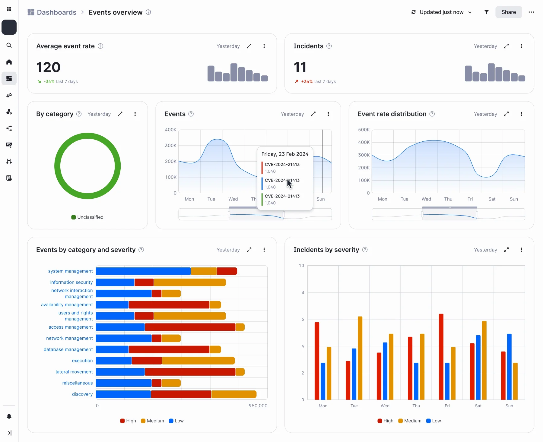
The Events overview dashboard: average event rate and incidents with their trends, incidents by category, two area charts of events across the week, events by category and severity, and incidents by severity per day, with a hover tooltip open on the Events chart.
Events overview. Screens from my design files, translated to English and with the vendor's names taken out.

Where it started

Twenty products, one screen

Analytics lived in a separate product that had aged badly. The company decided to start a common platform for all of its products, more than twenty, and analytics was the first thing to move in. I designed it, and the platform's navigation alongside it.

Every product brings its own data: events, incidents, assets, vulnerabilities. Whatever I drew had to fit all of them, including the products that hadn't moved in yet.

Three decisions

Built for products that hadn't arrived

One model for every widget

Product, source, collection, then filters. Adding a product means adding a source; the screens stay the same.

Price: each product has to describe its data in this model first, so they come on one at a time, and widgets that mix products come later.
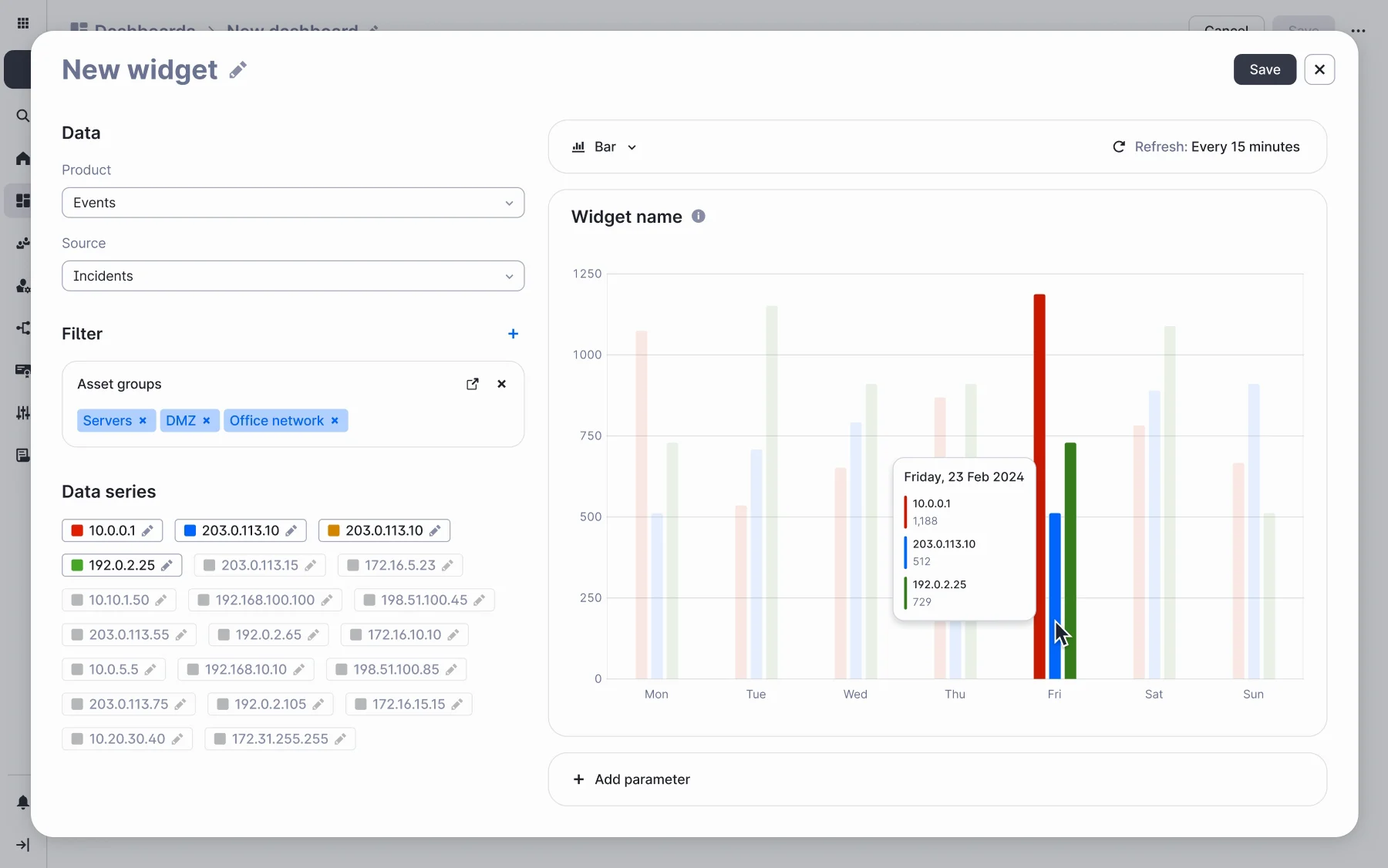
The widget builder: product Events, source Incidents, a filter by asset groups (Servers, DMZ, Office network), a list of data series, and a bar chart preview of three series across the week, with a tooltip open on Friday.
A widget from nothing — product, source, a filter by asset groups — first as a table, then switched to bars, clicked through the states from my files.

A grid with fixed steps

Widths snap to eight steps from 321 to 1,344 px with 20 px gutters, and each widget type has its own minimum and maximum. A dashboard built from three products still reads as one page.

Price: less freedom than free resizing.
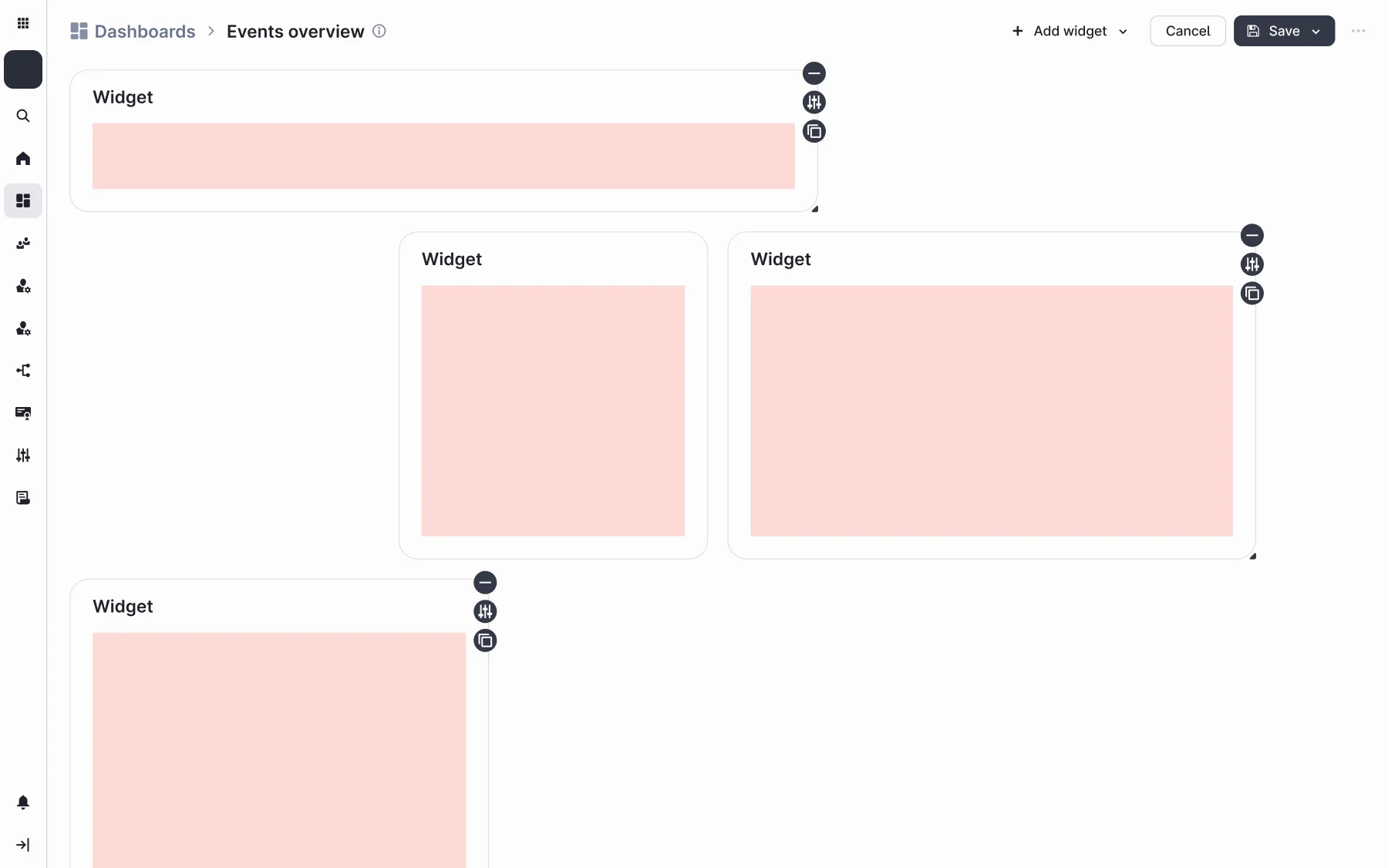
Edit mode: widgets on the grid with remove, settings and duplicate controls; a widget dropped into the next cell, and the top widget resized from 662 to 776 px, the next step of the grid.
Edit mode — a widget added from the menu, another dragged into a free cell, a third stretched to the next grid step.

Products bring their own dashboards

Standard dashboards and widgets ship with each product; people build their own on top, or unlink a copy and change it. Nobody starts from an empty screen.

Price: two template libraries, and the logic that keeps a dashboard tied to its template.
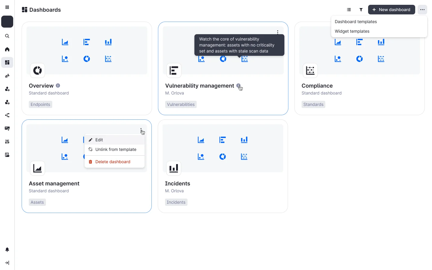
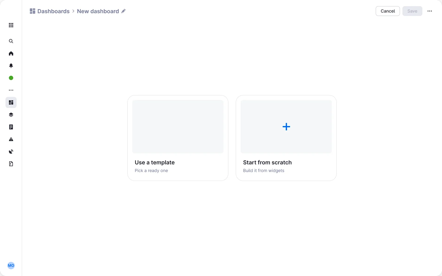
The dashboards list: five cards — Overview, Vulnerability management, Compliance, Asset management, Incidents — each marked standard or with an author and a product tag, with a card menu open on Edit, Unlink from template, Delete dashboard.A new dashboard with two starts: Use a template, pick a ready one; or Start from scratch, build it from widgets.

Beyond the module

Patterns for the whole platform

I led the shared patterns for the products that would move onto the platform later, so the move would hurt less, and acted as art director for that work: navigation, the top bar, filtering, search, tags. We built on the company's design system and started our own templates and patterns on top of it. The navigation and the top bar became the platform's own.
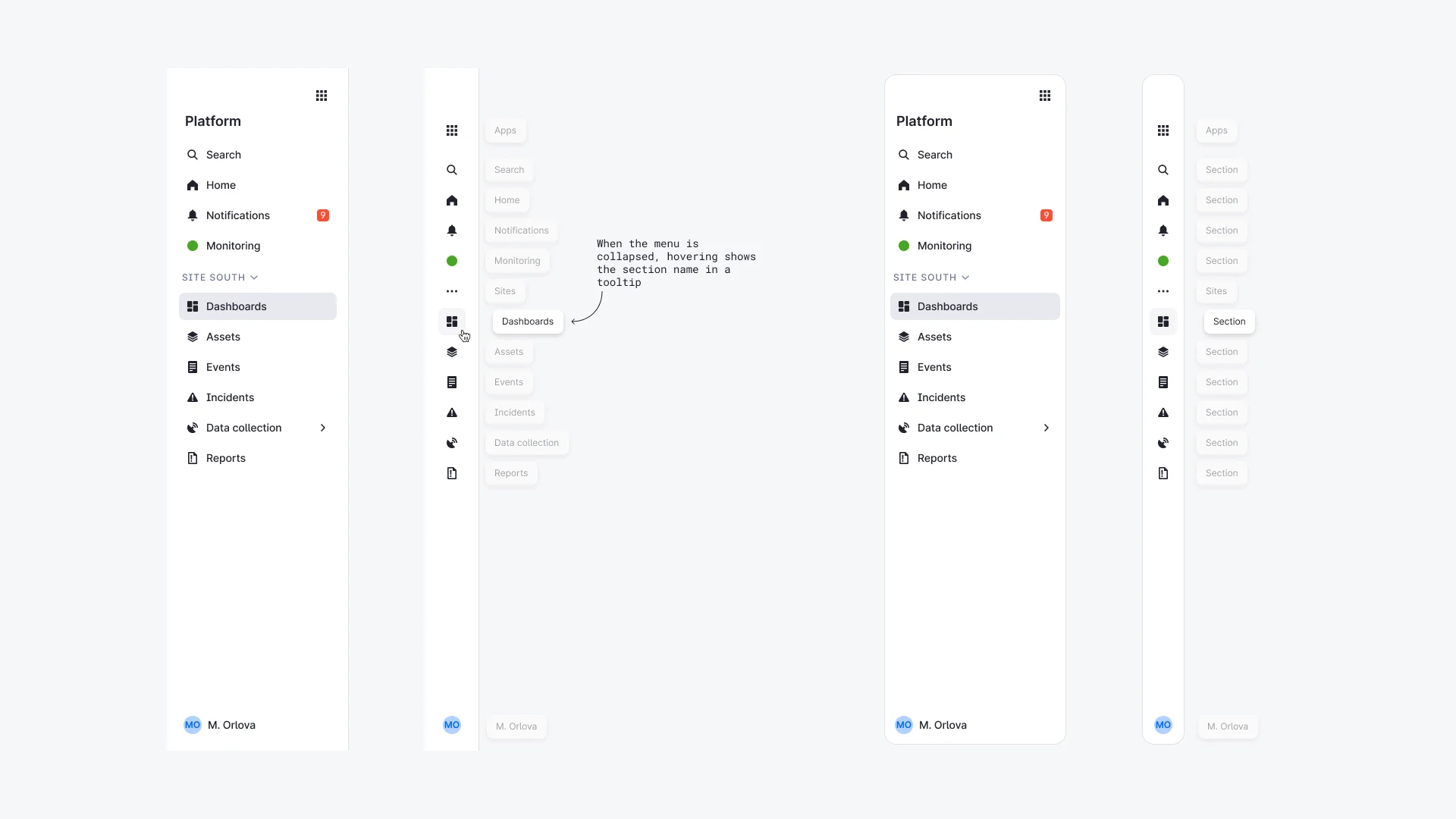
Four presets of the side menu: expanded, collapsed with a tooltip naming the section, and the same two floating. The menu holds search, home, notifications, monitoring, a site switcher, and the site's sections.
The side menu in four presets. Collapsed, it names the section in a tooltip.
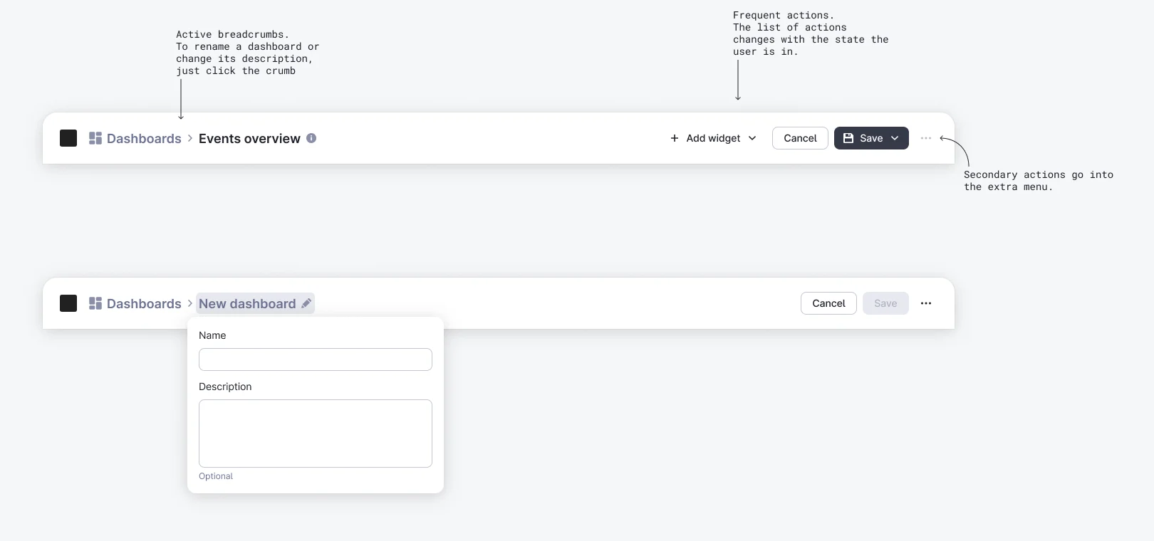
Two top bars with notes: the last crumb is clickable to rename the page; frequent actions change with the state; secondary actions go into the menu. Below, the rename popover with Name and an optional Description.
One top bar for every page. The crumb renames the page, the actions follow its state, the rest goes into the menu.

Nine parameters, one button

Axis labels, legend, scale, reference values, totals, merging small slices, thresholds, comparison with the last days — every chart parameter goes in through the same "Add parameter", so a new one never needs a new panel.
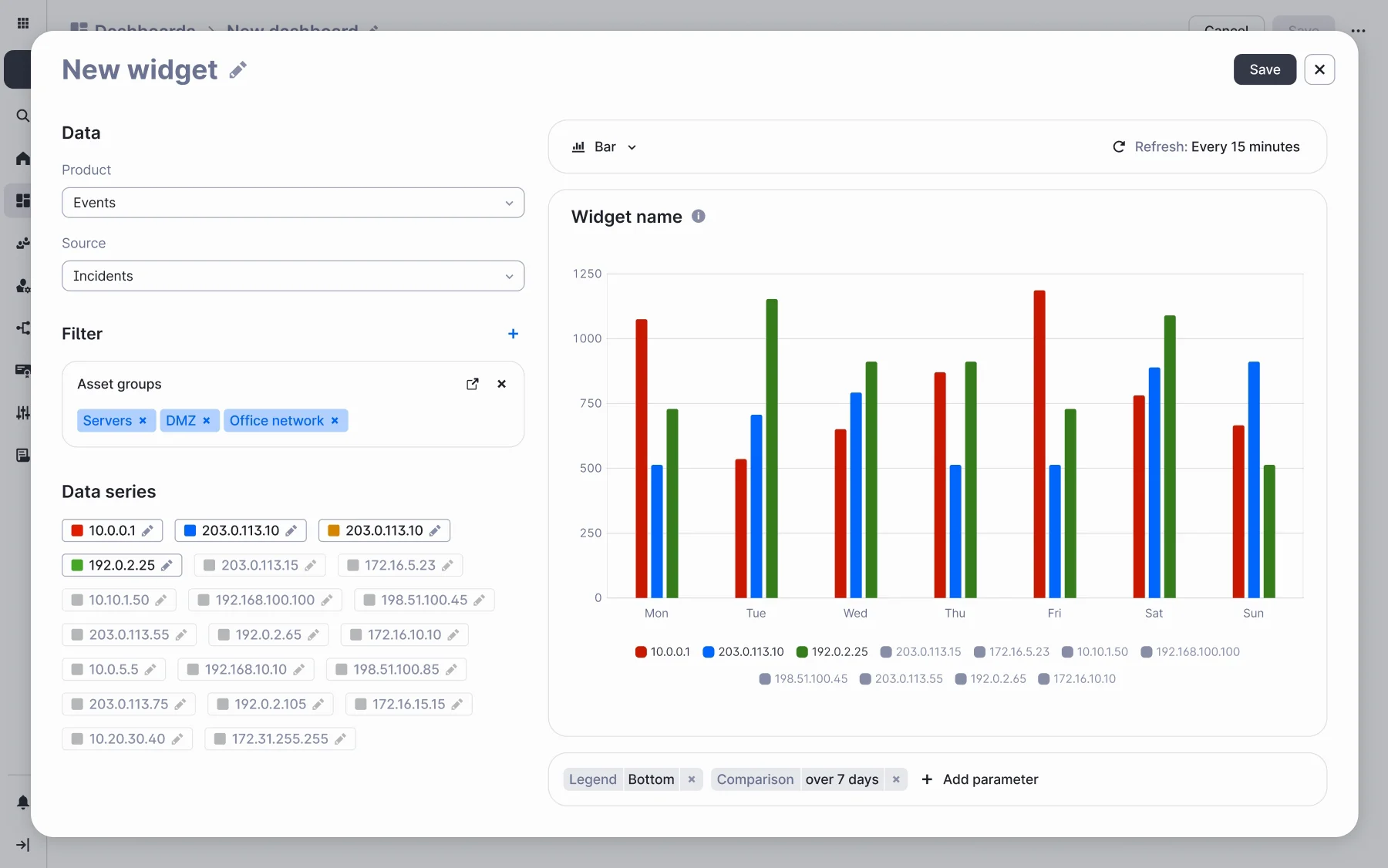
The widget builder with a bar chart: under it, a row of parameter chips — Legend: Bottom and Comparison: over 7 days — and the Add parameter button; a legend of the data series now sits under the chart.
One button for every parameter — the legend goes under the chart, the comparison takes the last 7 days, each lands as a chip.

Look closer

Any widget opens into a full view: the chart, and under it a table of the same series, where the ticked rows are the lines you see.
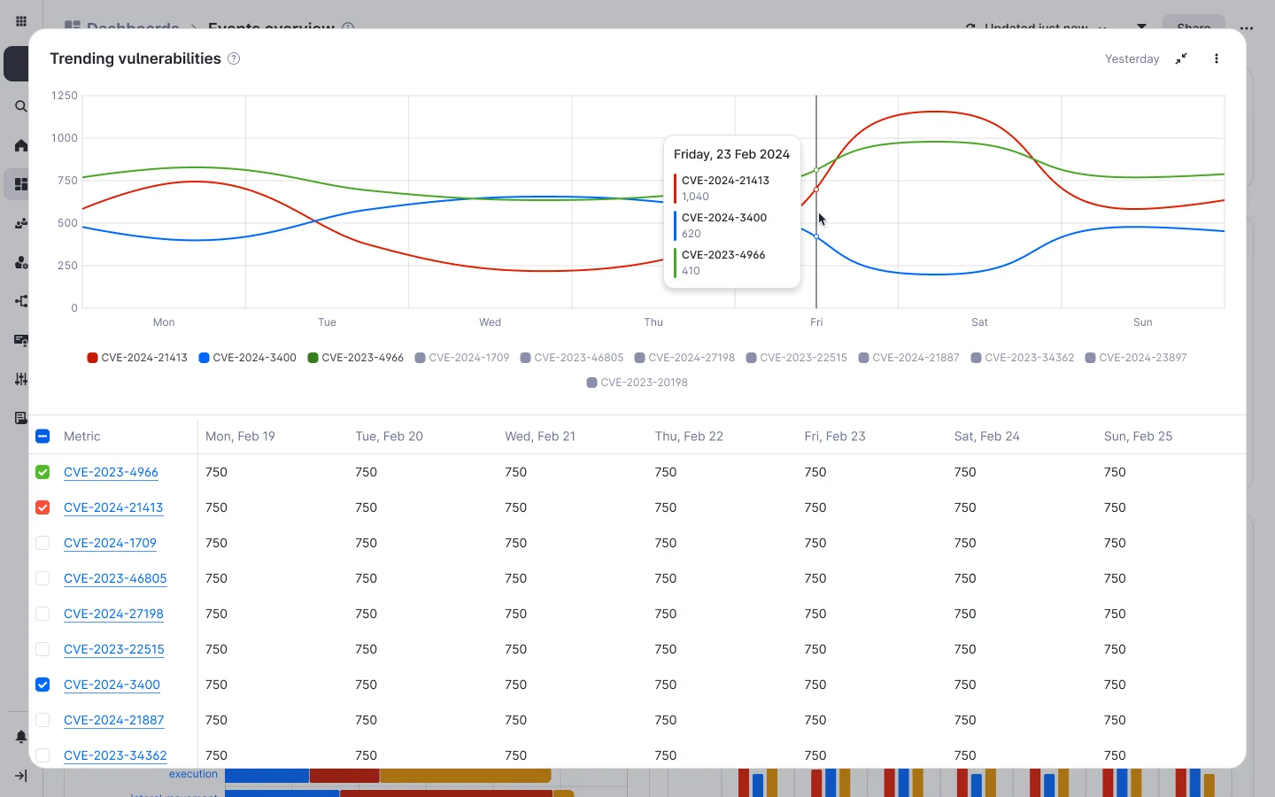
A widget in full view: a line chart of trending vulnerabilities with a tooltip for Friday, 23 Feb, and under it a table of the series by day, three of them ticked.
Full view of a widget.

My part

I was the designer on the analytics team, with designers reporting to me, and wrote the spec with a systems analyst. The modules went to engineering marked ready for development; the navigation and the top bar became shared across the platform, and the team built the platform on from there.

Next

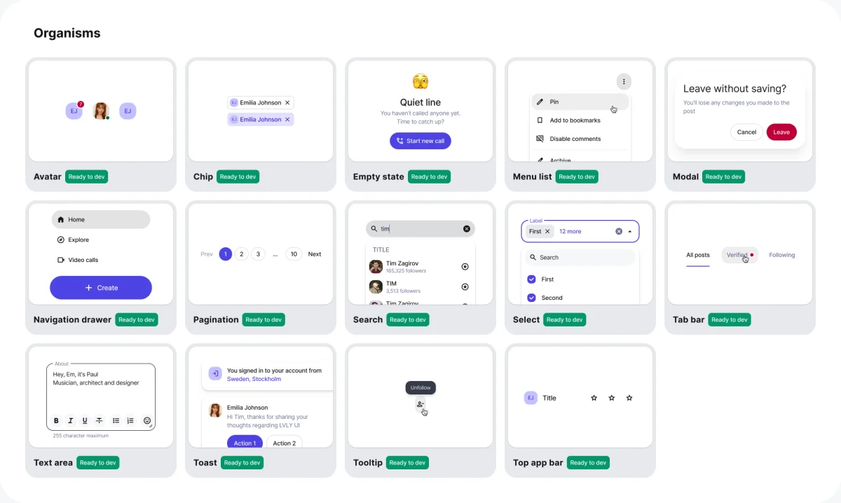
Lyvely DS organisms, each tile marked Ready to dev.

Lead Product Designer2024–2026

Lyvely DS

the design system every Lyvely screen is assembled from.