Lead Product Designer2024–2026Web, iOS, AndroidProduct design, product management, design system

Lyvely

A creator platform where fans pay: tips, paid posts, memberships and one-to-one calls. I redesigned it for web, iOS and Android while it stayed live.
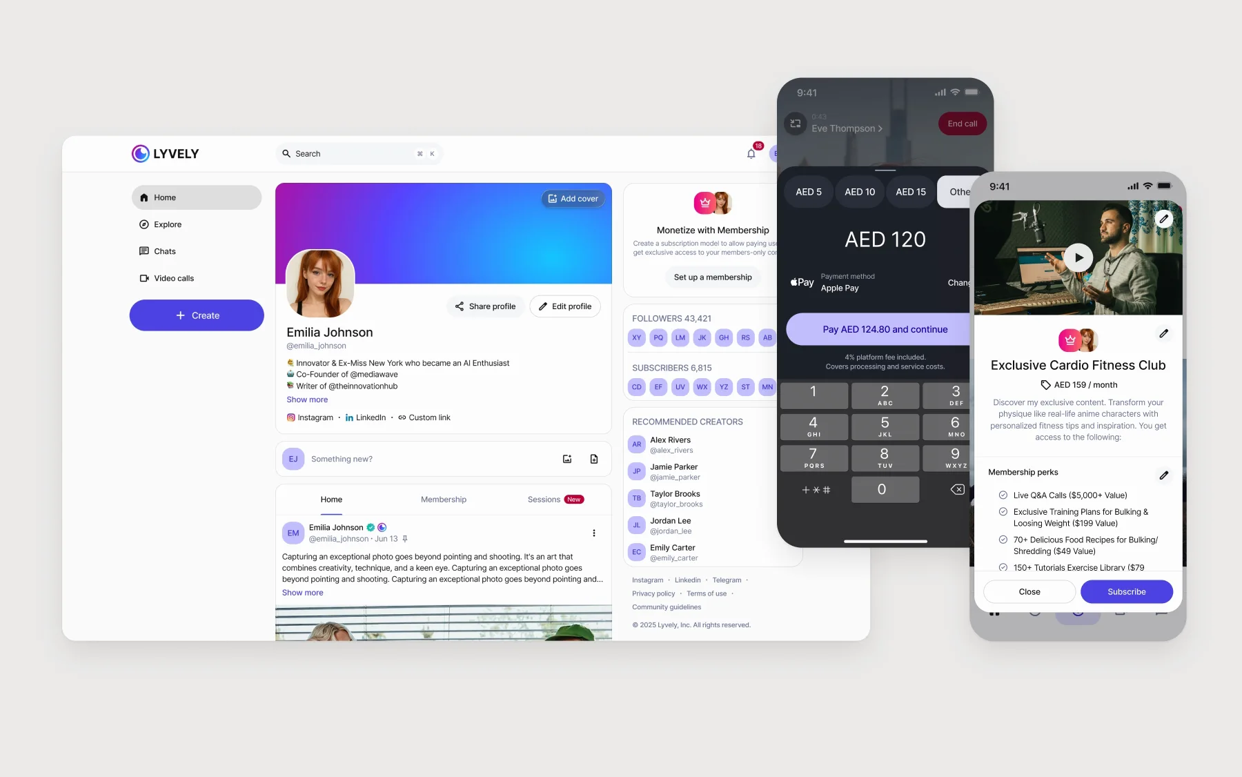
Lyvely after the redesign, playing: a creator's web profile; beside it a live call where the tip sheet rises and AED 120 is typed in; and a membership page with price and perks sliding up over the feed.

Where it started

Three problems, stacked

  • The look. Magenta, teal and orange fought on a purple gradient. Small grey type on purple.
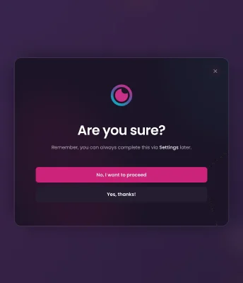
  • Onboarding. Ten screens before the product. Sign-up asked “Are you interested in being a Creator?” and answered “No” with “Are you sure?”.
  • No system. Every screen was drawn from scratch.

And one condition over all three: the product could not stop. Everything new shipped on top of the live app.
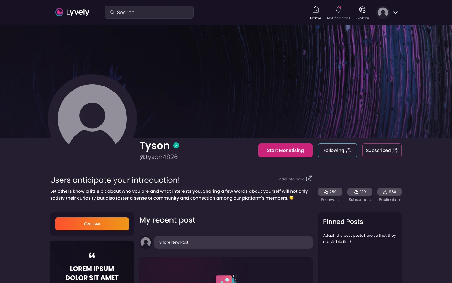
The old profile page: dark purple, an empty avatar, Start Monetising and Go Live buttons, a Lorem ipsum card, three empty blocks.
Before. The profile page.
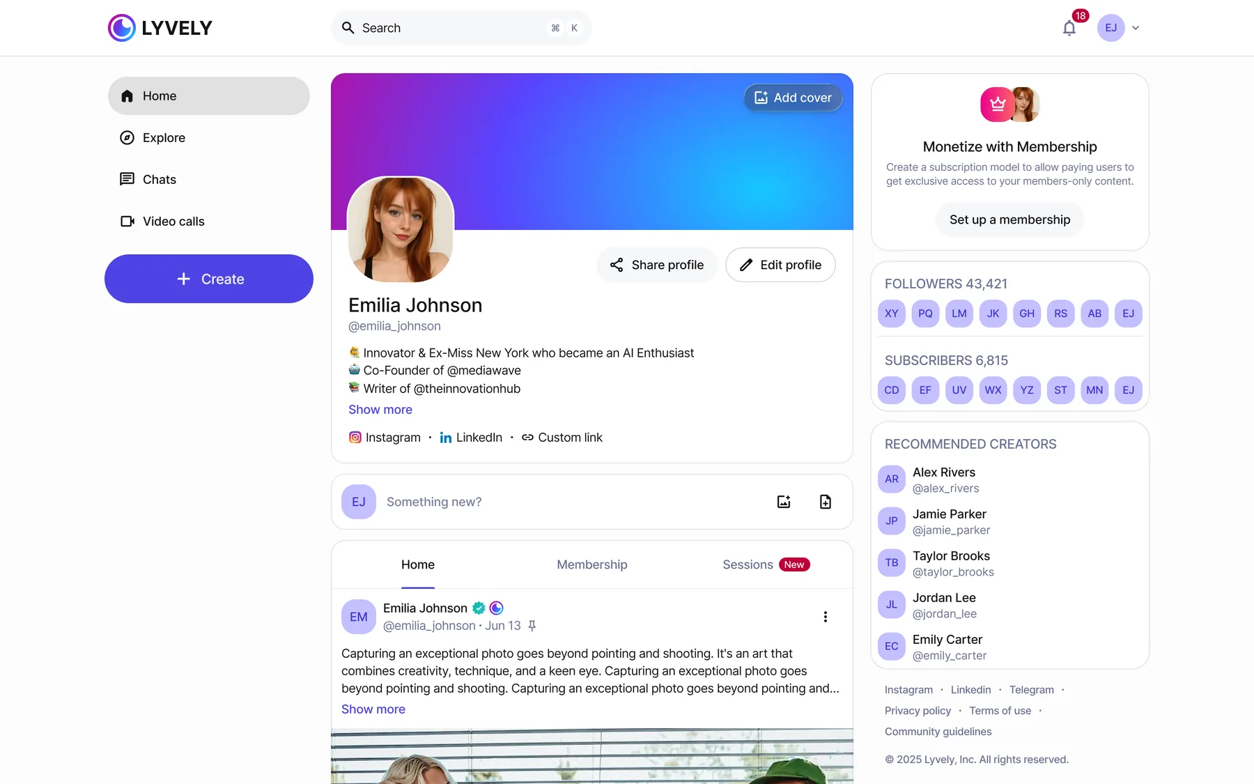
The new profile page: navigation, cover and avatar, Share and Edit profile, tabs for Home, Membership and Sessions, and a side column offering to set up a membership.
After. The same page. One accent, and a way to earn in plain sight: Membership and Sessions sit next to Home.

Onboarding

Ten screens became three

Phone, code, name and avatar. Then the product. The benchmark was the best products in the category: nothing before the first screen that the user doesn’t need yet.

The price: creator setup had to live somewhere else. It moved to where it is wanted — the profile, prompts in empty states, and a monetisation flow that opens the first time someone wants to get paid.
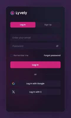
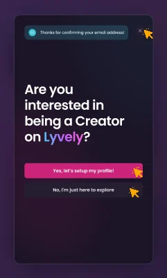
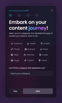
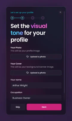
Old log-in card.“Are you interested in being a Creator on Lyvely?”“Are you sure?” after answering no.Creator setup 1: categories.Creator setup 2: photo, cover, occupation.
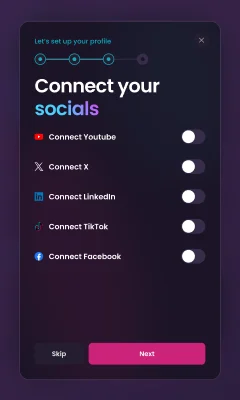
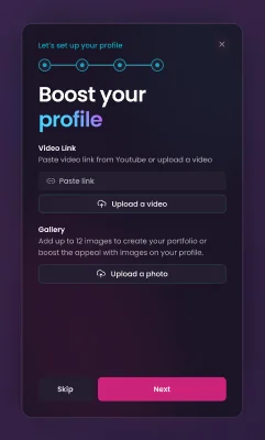
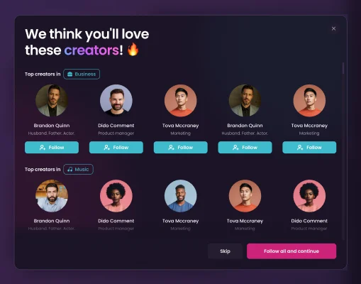
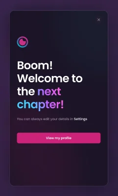
Creator setup 3: connect five socials.Creator setup 4: video and gallery.Creator setup 5: suggested creators.Creator setup 6: “Boom! Welcome to the next chapter!”
Before. Log-in, the creator question, “Are you sure?”, six setup steps.
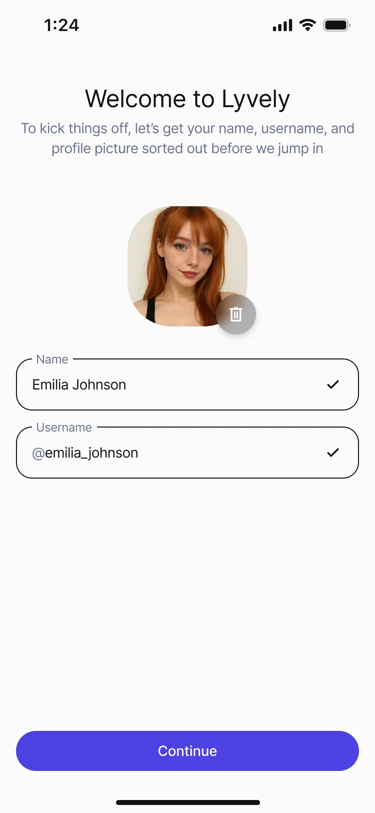
The new sign-up playing: Welcome to Lyvely, Create new account; a UAE number typed in and confirmed; the six-digit code filled in and turning green; an avatar picked, name and username filled; Continue — and the feed.
After. Welcome, phone, code, name and avatar — then the feed. The wrong code, the expired code and the taken username are drawn too.

The business

Every surface can take money

Lyvely earns only when creators do. So paying had to be one tap away everywhere a fan already is — the feed, a profile, a call — and never in the way of the content.
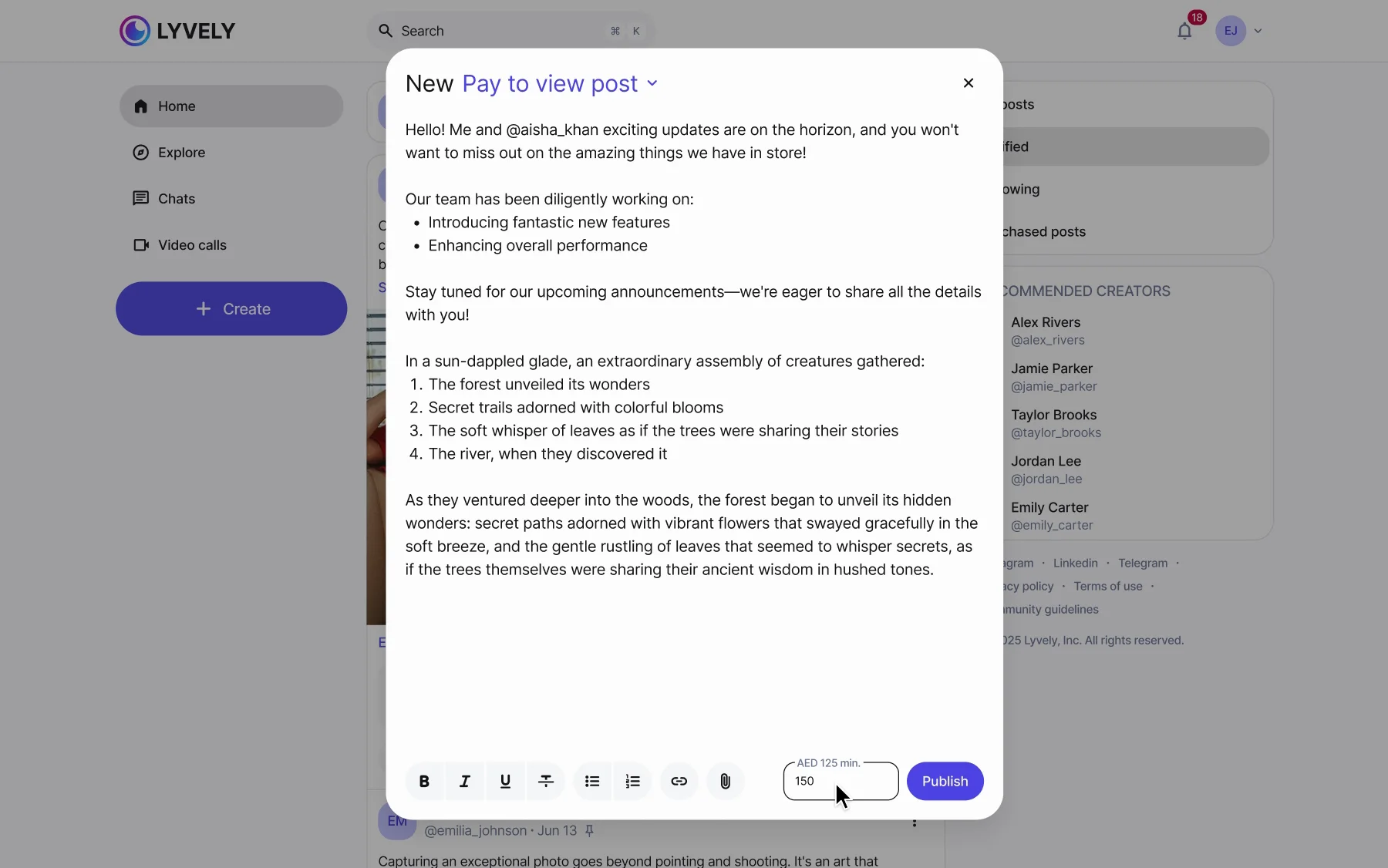
The post composer playing: the post type opens from the title — Public post, Members only, Pay to view — Pay to view is picked, a price of AED 150 is typed next to Publish, and the post is published.
The switch lives in the composer. A post is free, members-only or pay-to-view, with a price.
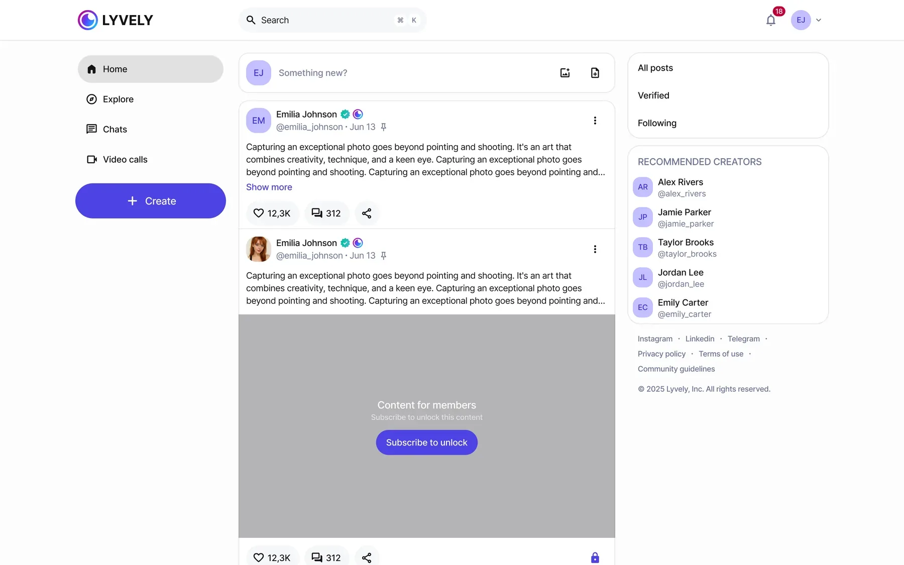
The feed with a members-only post shown blurred behind Subscribe to unlock.
The lock lives in the feed. Locked posts stay in everyone’s feed, blurred, so they sell themselves.
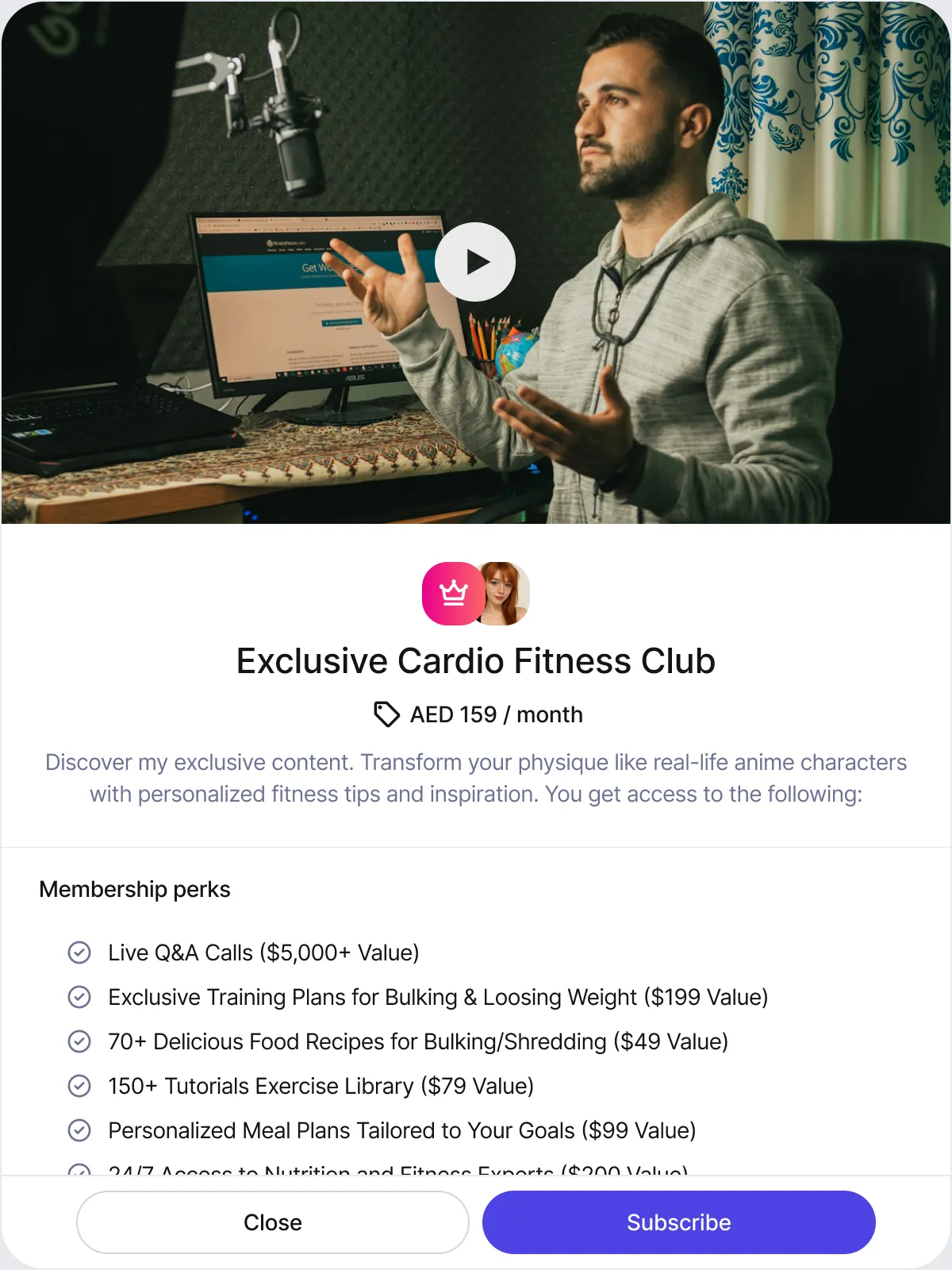
A membership on the web: Exclusive Cardio Fitness Club, AED 159 a month, a video cover and priced perks.
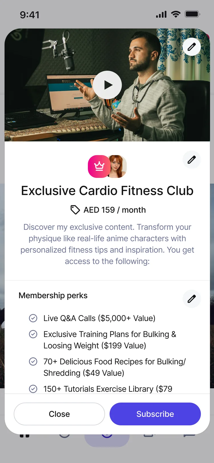
The same membership on the phone.
A membership is a product page. Price, a video, perks with their value. Same page on the web and on the phone.

Calls

Calls became a product of their own

Coaches and consultants on Lyvely sell their time. I led calls end to end, and three decisions shaped them.

Tips inside the call

Money arrives when the fan is most engaged. A sheet slides over the video: AED 5, 10, 15 or any amount, with the 4% fee stated before you pay.

Price: a money button next to a live conversation.
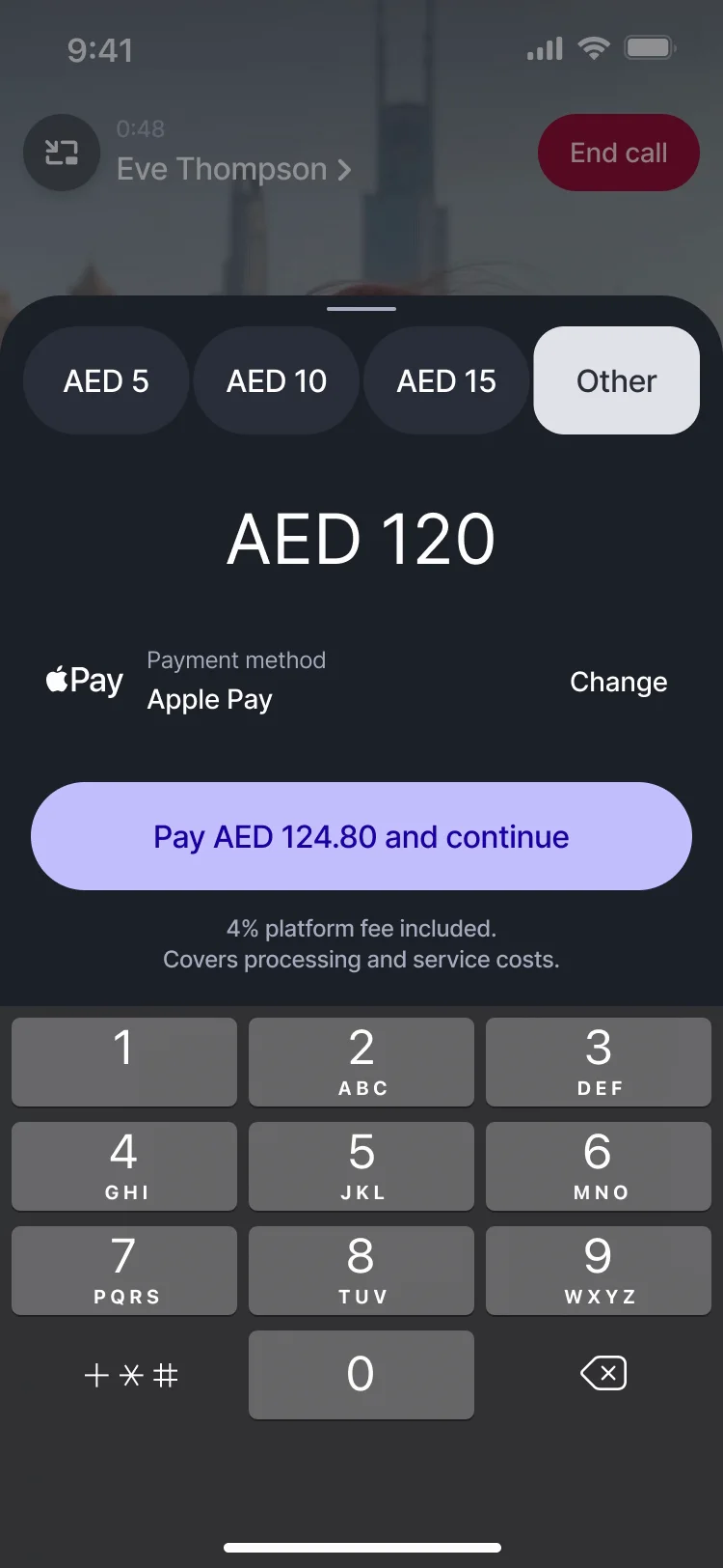
A one-to-one video call playing: the tip sheet slides up over the video with AED 5, 10, 15 and Other; Other opens a custom amount, the keypad comes up, AED 120 is typed in with Apple Pay and the 4% fee, Pay AED 124.80 is pressed, and the sheet goes down again over the call.

Booking

A coach needs slots, a time zone and payment up front, or they take the client to Calendly and Zoom. The payment is reserved and charged only once the host confirms.

Price: a calendar, time zones, cancellations and refunds inside the product.
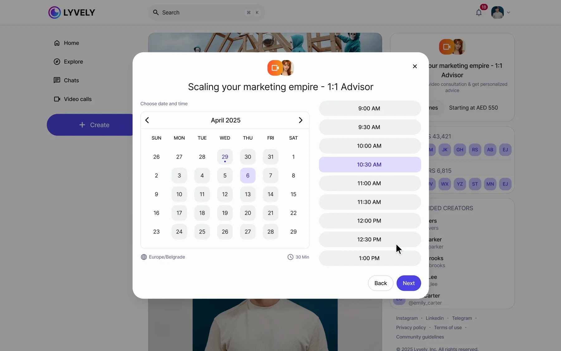
Booking a 1:1 session playing: See times on a coach's profile; 30 minutes for AED 550; April 6 at 10:30 in the Europe/Belgrade time zone; the request with the price, charged only after the host confirms; and “Payment reserved. It will be processed once the host confirms.”
Duration, then a slot in your own time zone, then the request. “Payment reserved. It will be processed once the host confirms.”
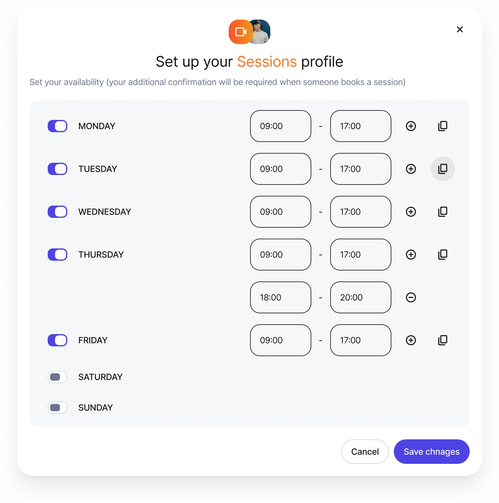
The host sets availability: hours per day, split shifts, copy to other days.
The host’s side. Hours per day, split shifts, copy to other days.

A section of their own

Scheduled, recents, recordings. Everything about a call in one place, not buried in a profile.

Price: one more tab competing with the feed.

The edges are drawn too: groups of twelve and more, screen share, recording with a visible REC and a consent prompt, and “Are you still here?” before an empty call wraps up.
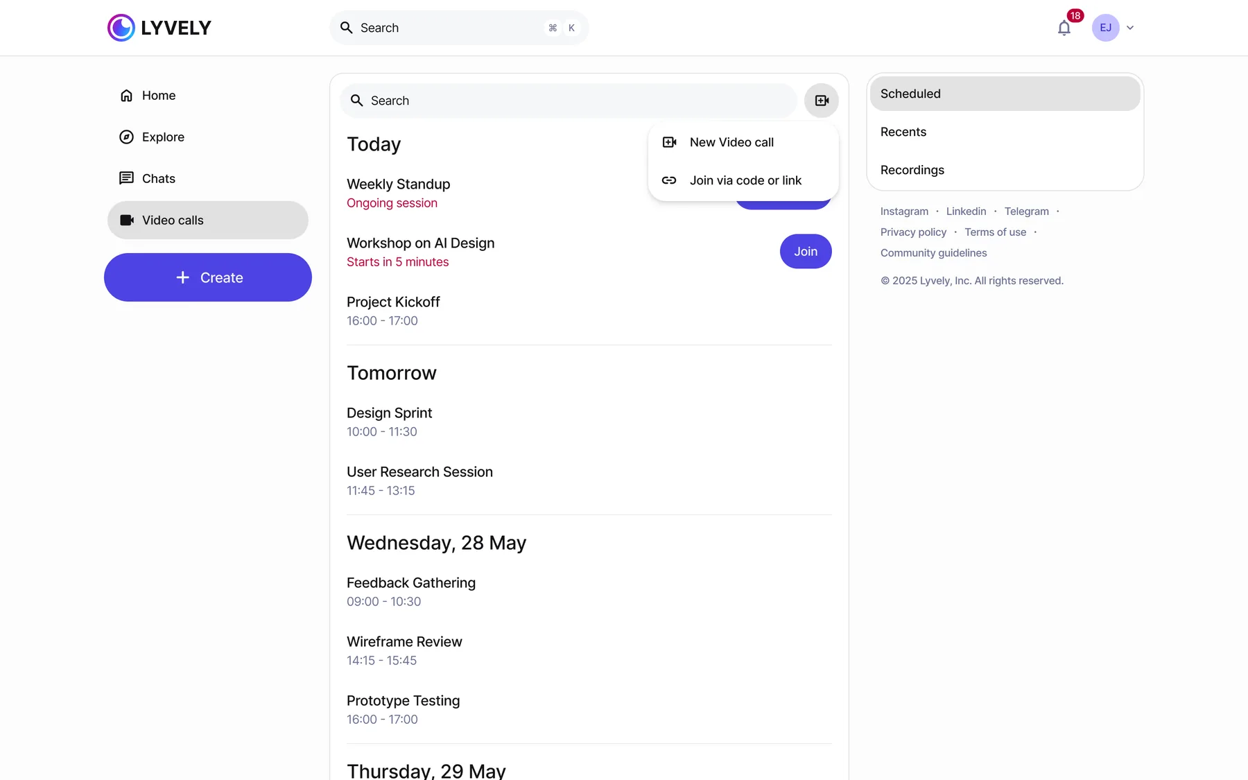
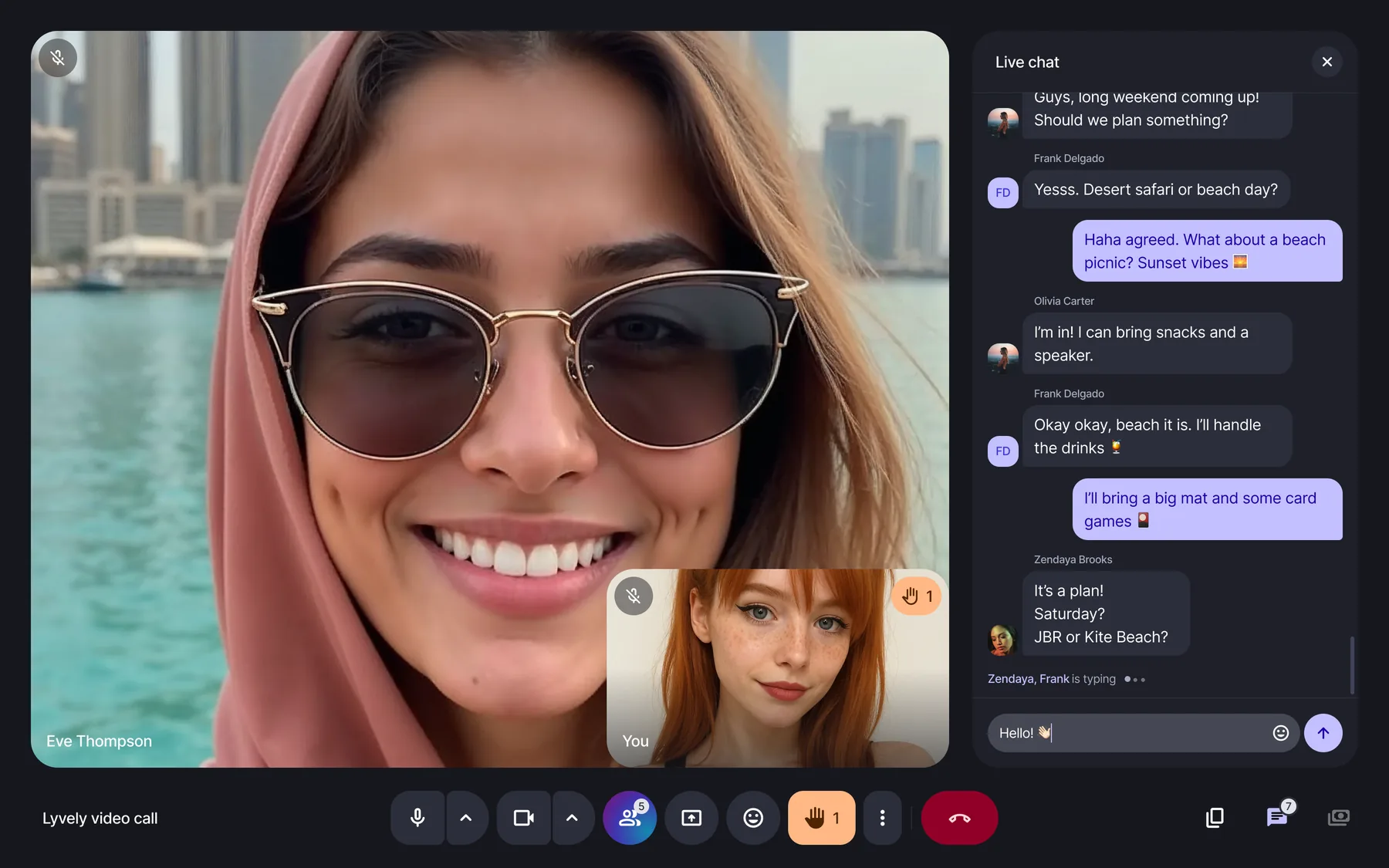
The calls section: today, tomorrow and later, with Scheduled, Recents and Recordings.
A call in progress with live chat open.

The sound of a call

I composed and mixed the call sounds myself, from one motif. The ringtone plays it in full; every event in a call is a short phrase of it. They are shorter and quieter than the system sounds, so they say what happened without talking over the person. They shipped on the web, iOS and Android.

  • Lyvely The ringtone — the motif in full
    1:03
  • Calling While the other side rings
    0:08
  • Call started
    0:02
  • Someone wants to join For the host
    0:04
  • Hand raised In a group call
    0:02
  • Mic on
    0:02
  • Mic off
    0:02
  • Notification
    0:02
  • Connection issue
    0:06
  • Call ended
    0:02

The creator’s side

Where the money comes from, and when it arrives

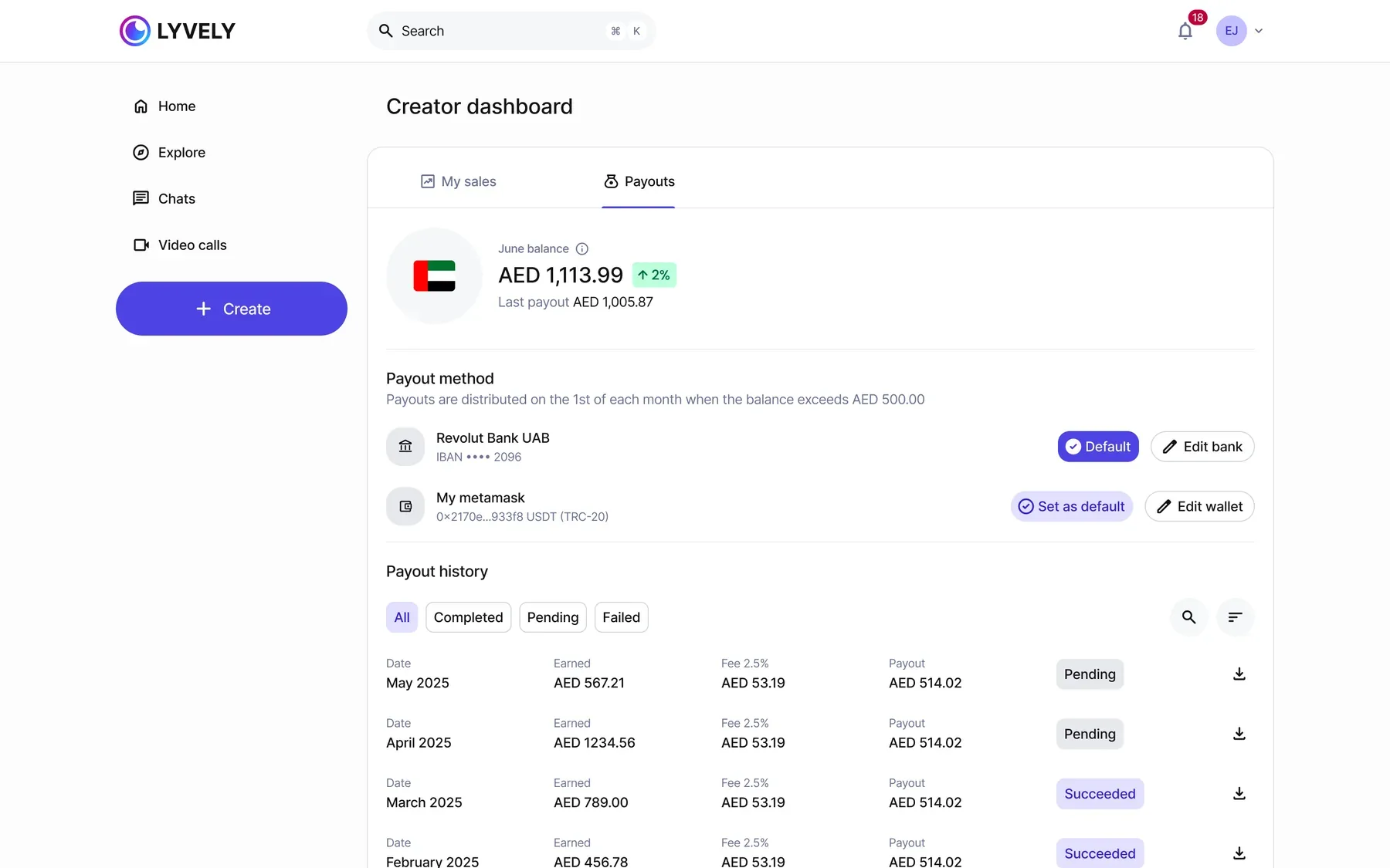
Four streams — paid posts, sessions, memberships, tips — as four tiles, each with its own table. Payouts go out monthly to a bank or a USDT wallet; a failed payout says so and offers to try again.
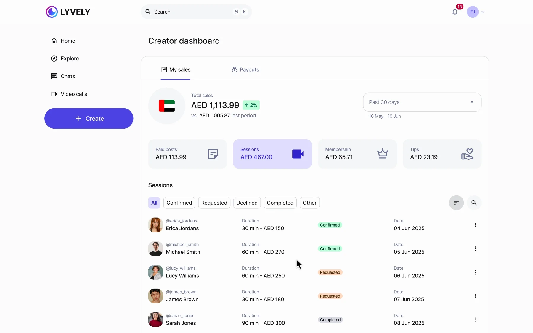
The creator dashboard playing: total sales and four revenue tiles; clicking Membership, Tips and Sessions swaps the table below — members with their status, tips from fans, sessions with Confirmed, Requested and Completed — and the sort menu opens: Recent, Oldest, Duration.
Sales by stream, each tile with its own table. Sessions show Requested, Declined and Payment declined.
Payouts: the payout method, the schedule and the history with failed rows.
Payouts, with the failures in the history, not hidden.

Details

The quiet screens

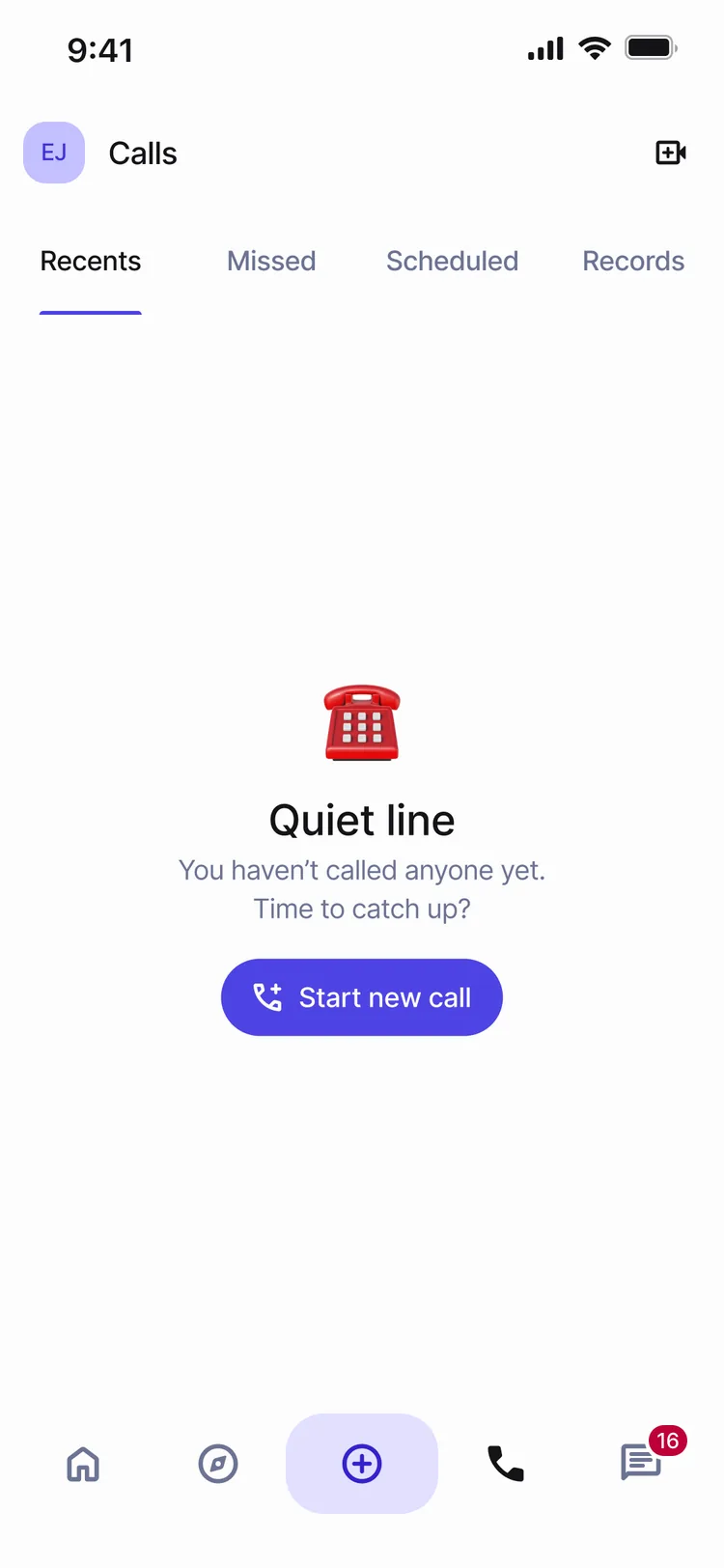
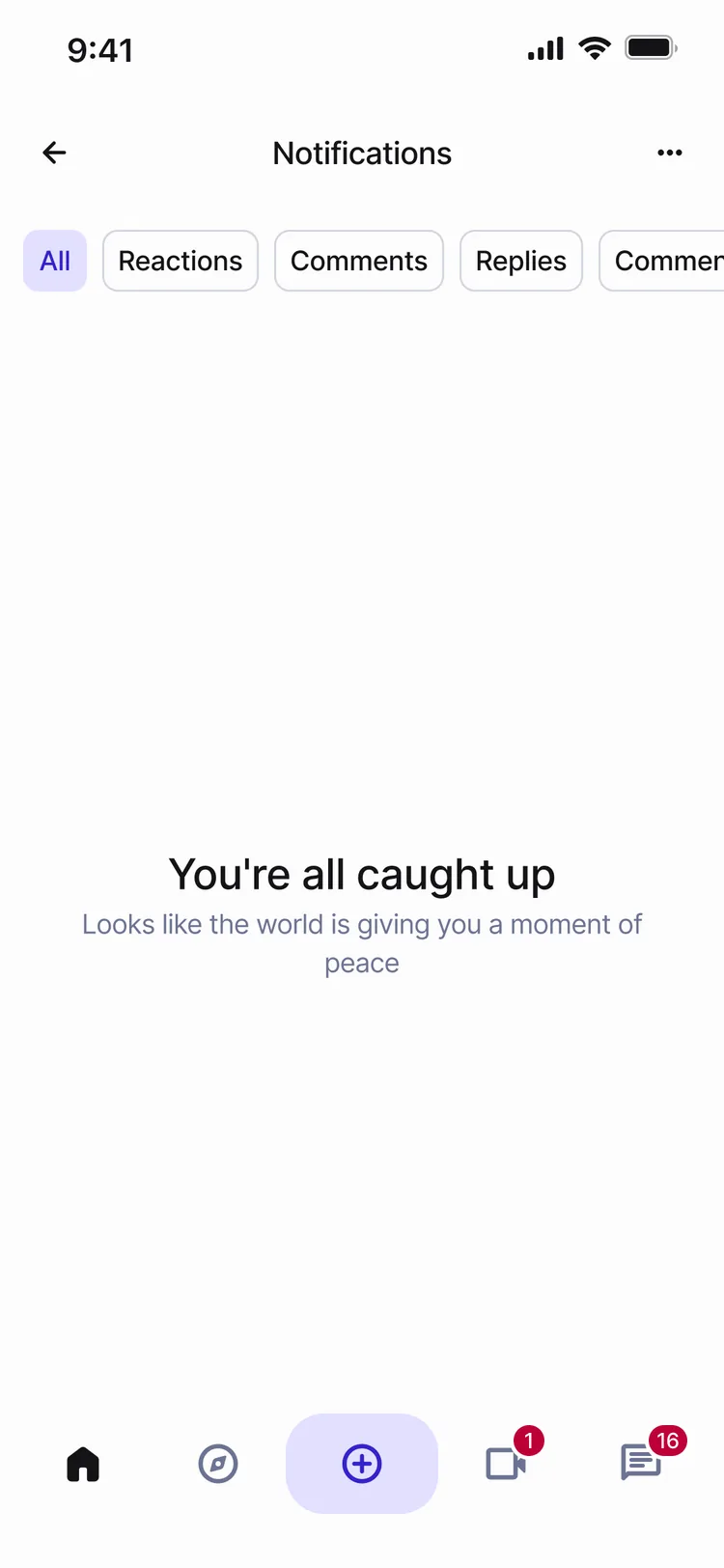
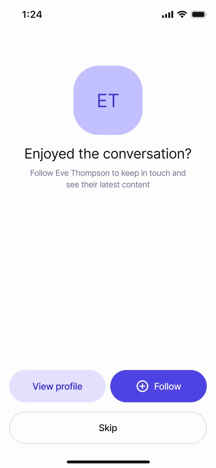
Quiet line. You haven’t called anyone yet. Time to catch up?You’re all caught up.After a call: Enjoyed the conversation? Follow to keep in touch.
Empty and after states say something. “Quiet line. Time to catch up?” — and after a call, a reason to follow.
The profile playing: the account menu opens to Theme — Light, Dark, System — Dark is picked and the whole page turns dark, then back to Light the same way.
Dark is a real theme. Sign-in, profile, settings, memberships and explore each have a full dark twin, and a Light / Dark / System switch.

The system

A new screen: a week → two days

Every screen above is assembled from Lyvely DS, the design system I built — one accent, two themes, a status on every component. Measured by sprints, a new screen went from a week to two days.
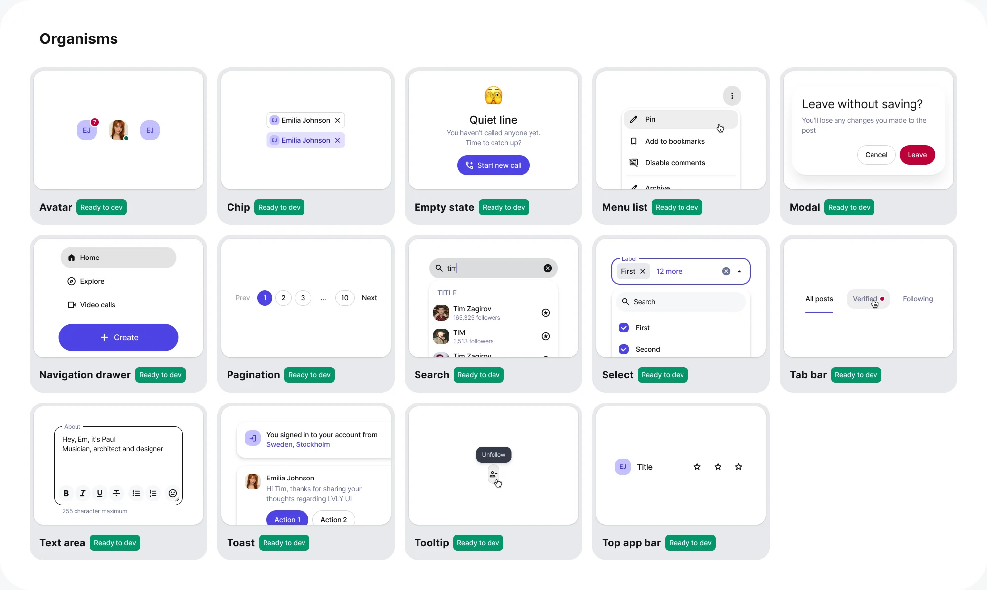
Organisms overview: avatar, chip, empty state, menu list, modal, navigation drawer, pagination, search, select, tab bar, text area, toast, tooltip, top app bar.

My part

Designer, product manager, feature lead

On onboarding and calls I wrote the requirements, cut the tasks, drew the screens and accepted the builds, working directly with the founders and engineering. I came in to replace the previous design team; the designers hired after reported to me.

Next

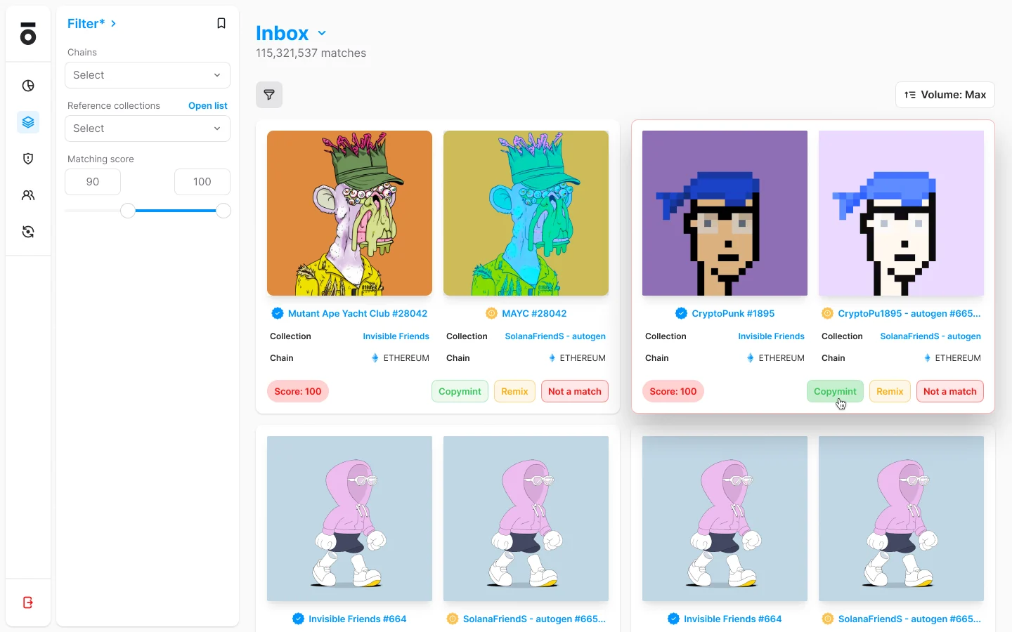
The Optic moderation tool: an inbox of 115,321,537 matches, each a pair of NFTs side by side with its collection, chain and a match score, and three verdicts — copymint, remix, not a match.

Head of Design2022–2025

Optic

the NFT moderation tool OpenSea's own moderators used, and OpenSea then acquired.