Lead Product Designer2024–2026Web, iOS, AndroidDesign system, handoff to engineering

Lyvely DS

The system every Lyvely screen is assembled from: 26 component pages and about a thousand variants for web, iOS and Android, light and dark from one set of tokens. I built it under a product that never stopped.
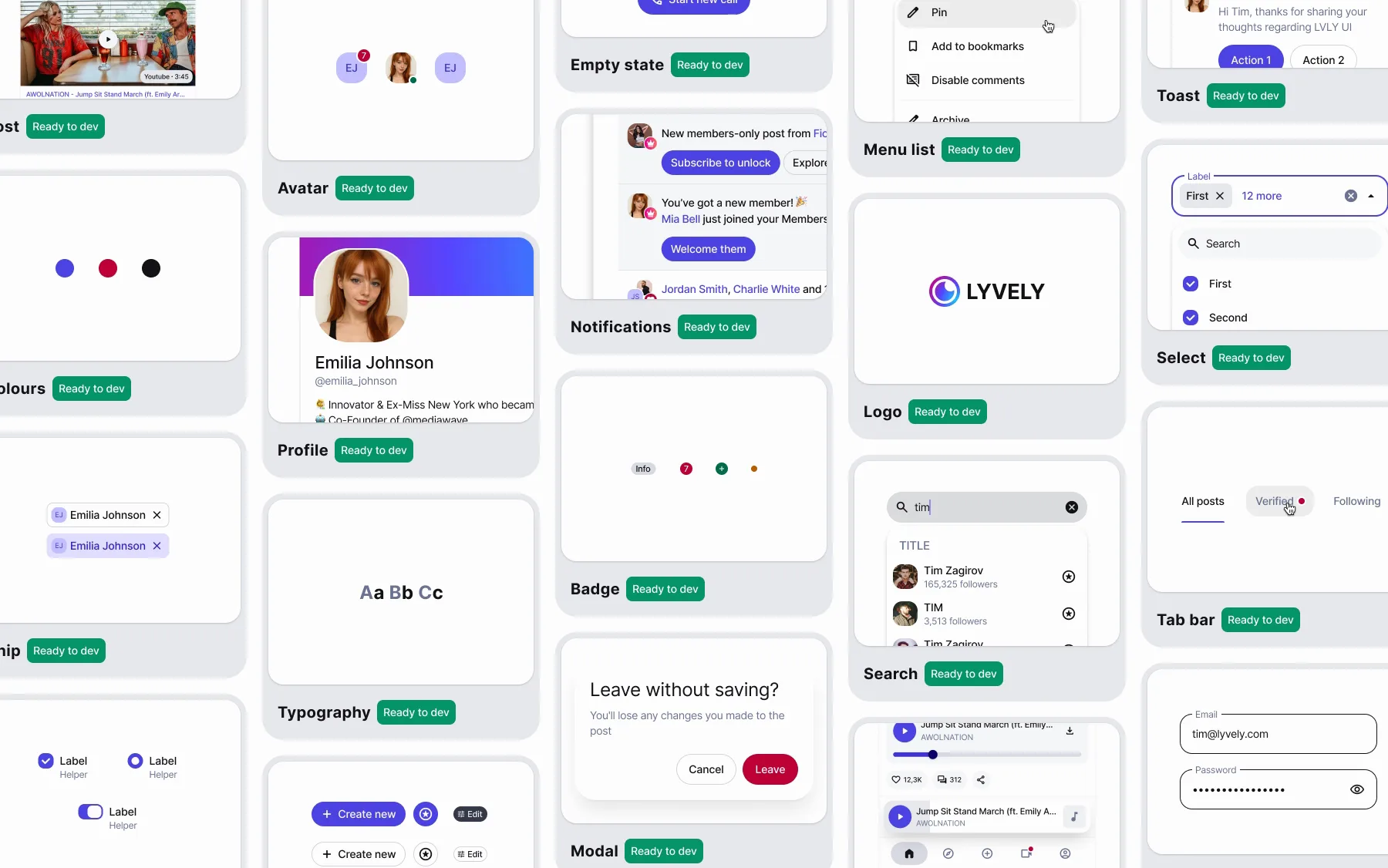
The cover page of Lyvely DS drifting past in five columns: Post, Avatar, Empty state, Menu list, Toast, Profile, Notifications, Logo, Select, Chip, Typography, Badge, Search, Tab bar and more, each tile marked Ready to dev.

A system under a live product

When I came to Lyvely, every screen was drawn from scratch, and magenta, teal and orange fought on a purple gradient. The product couldn't stop for a redesign, so the system had to grow underneath it while it shipped.

I built it from the bottom up: tokens, atoms, molecules, organisms, templates. A new screen is assembled from those parts, not drawn again. The price was time on the system before new screens appeared.

Tokens

One accent, two themes

163 primitives in Pallette, 70 tokens in Theme. Components only use Theme, and each Theme token points at one tone in Light and another in Dark. One indigo replaced the magenta, teal and orange.

The price: I gave up the loud magenta brand.
Pallette / Primary
5 10 15 20 25 30 35 40 50 60 70 80 90 95 98 99
Pallette / Neutral
5 10 14 15 20 25 30 35 40 44 45 50 55 60 70 80 82 85 87 90 92 95 97 99 100
  1. 1 Primary/40 80 Primary/Primary Button · Primary — fill
  2. 2 Primary/99 20 Primary/On Primary Button · Primary — label
  3. 3 Neutral/5 100 Surface/On Surface Post, Chip, Button · Tonal — text
  4. 4 Neutral/100 14 Surface/Surface Container Lowest Post — card
  5. 5 Neutral/97 20 Surface/Surface Container Low Button · Tonal — fill
Switch the mode and every token moves to another tone. The components that use it stay as they are.
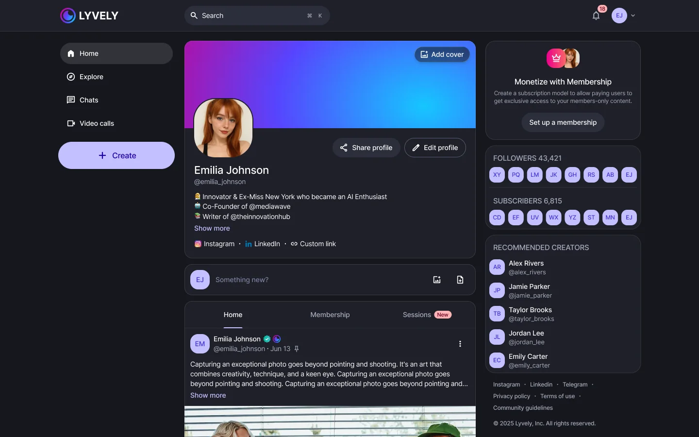
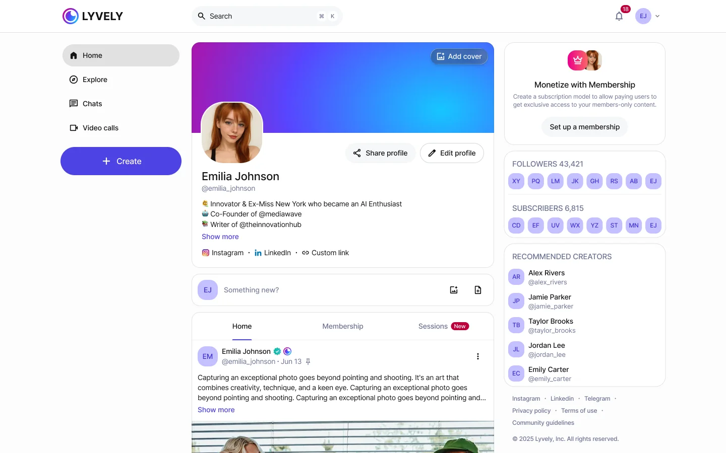
The new profile in the light theme: navigation, cover and avatar, Share and Edit profile, Home, Membership and Sessions, and a side column with followers and recommended creators.
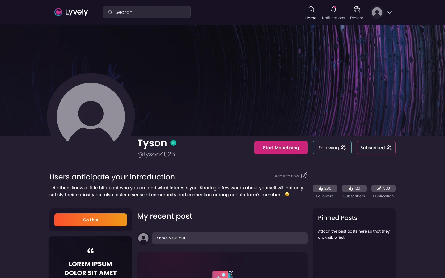
The profile in both modes, and the page it replaced.

Atoms

Colour, type, depth, blur

15 text styles on one type scale, six elevations and a border, four blurs, 18 sizes and 10 radii, each in light and dark.
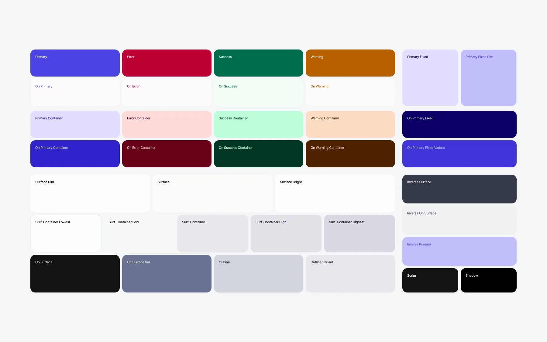
The Styles page of the DS file panning from the colour tokens to the type scale (Inter, Display to Body), the six elevations in light and dark, and the four blurs.
The Styles page of the file. Press a group to go to it.

Molecules

One button, 208 variants

Seven styles, four sizes, four states, and a square version of each. Every button in the product is one of them.

Style
Size
State
Mode
Each combination is the variant from the file, cut out of one export of all of them.

Organisms

Parts that carry their states

Menus, modals, search, select, toasts, text areas. Each is built from molecules and holds every state it can be in, so nobody draws a hover or an empty state twice.
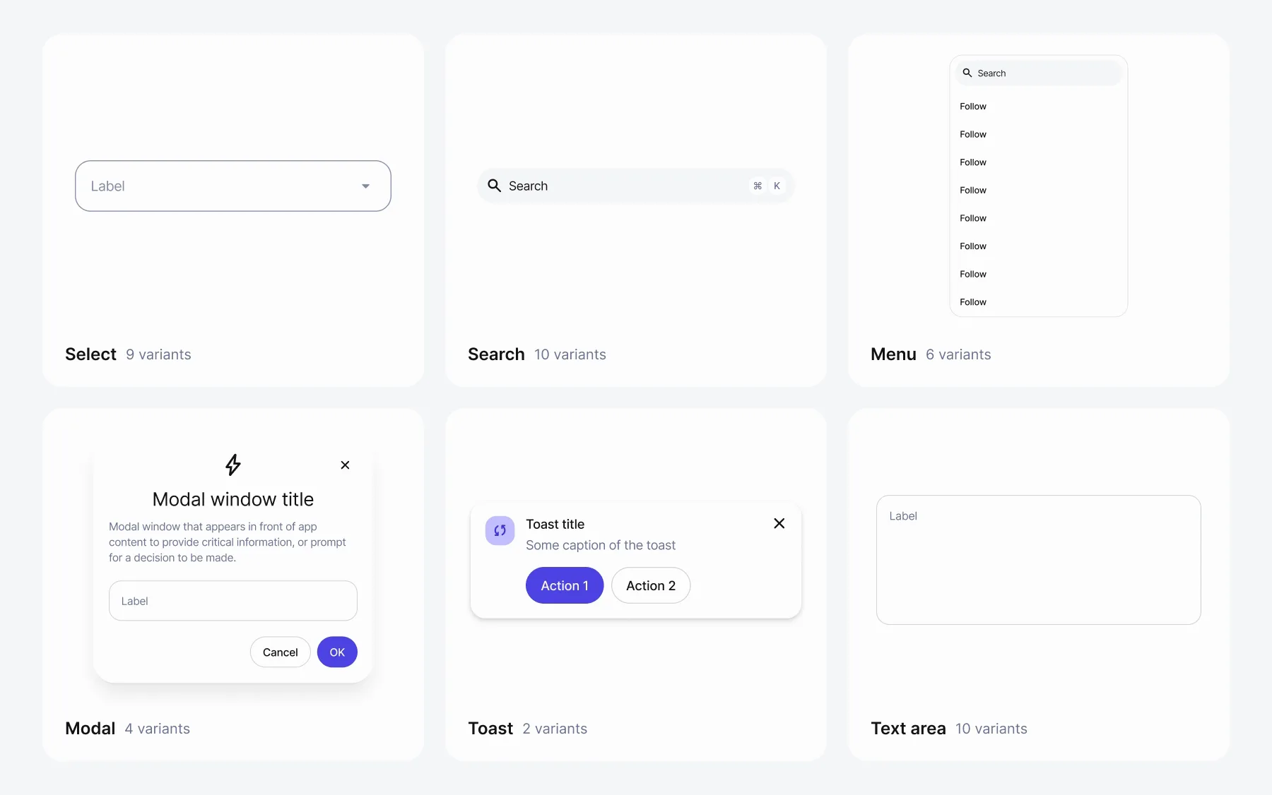
Six organisms going through their variants: Select from default to chips to disabled, Search from empty to typing, Menu with results, scrolled and empty, Modal with and without an icon, Toast in one and two lines, Text area through its states.
Six of the fifteen organism pages, going through their variants.

Templates

The Lyvely layer

Post, Profile, Notifications, Navigation bar and Sheet are the parts only Lyvely has, assembled from everything below them.

The five templates on the cover page: Navigation bar, Notifications, Profile, Post and Sheet, each marked Ready to dev.
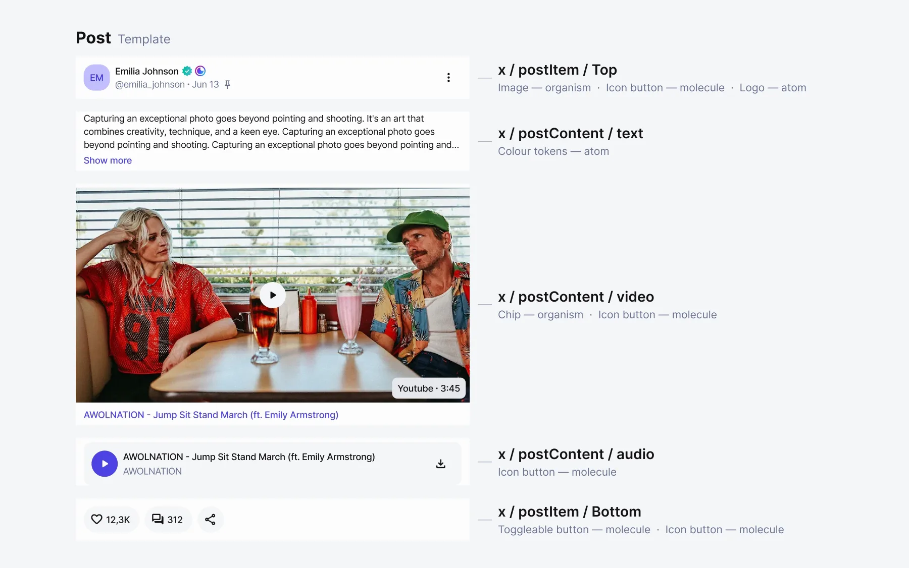
Post comes apart into its five parts — x / postItem / Top, x / postContent / text, video and audio, x / postItem / Bottom — each labelled with the components inside it and their level, then goes back together.
Scroll to take Post apart. Each part is named as in the file, with the components inside it and their level.

Screens

A screen, assembled

The web profile as it is in the product file. 72 of its parts are instances of the system; three are specific to this screen.

Lyvely's web profile, with a frame round every design-system component on it.
75 frames on one screen: every visible component instance in the file, coloured by level. Hover one for its name.

Handoff

Status is part of the component

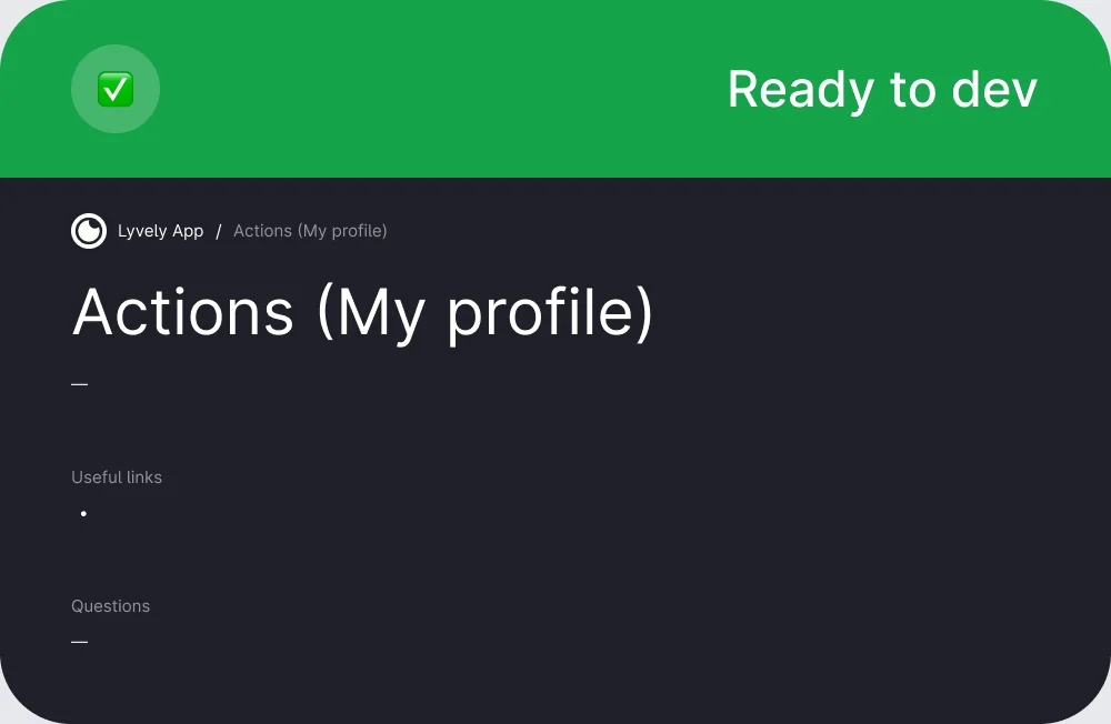
Every component goes through To design, Draft, WIP, To review and Ready to dev, and carries its status next to its name. Every section of the product file opens with a handoff card. The product couldn't stop, so engineering had to see in the file what was final.

The price: statuses kept honest every day.
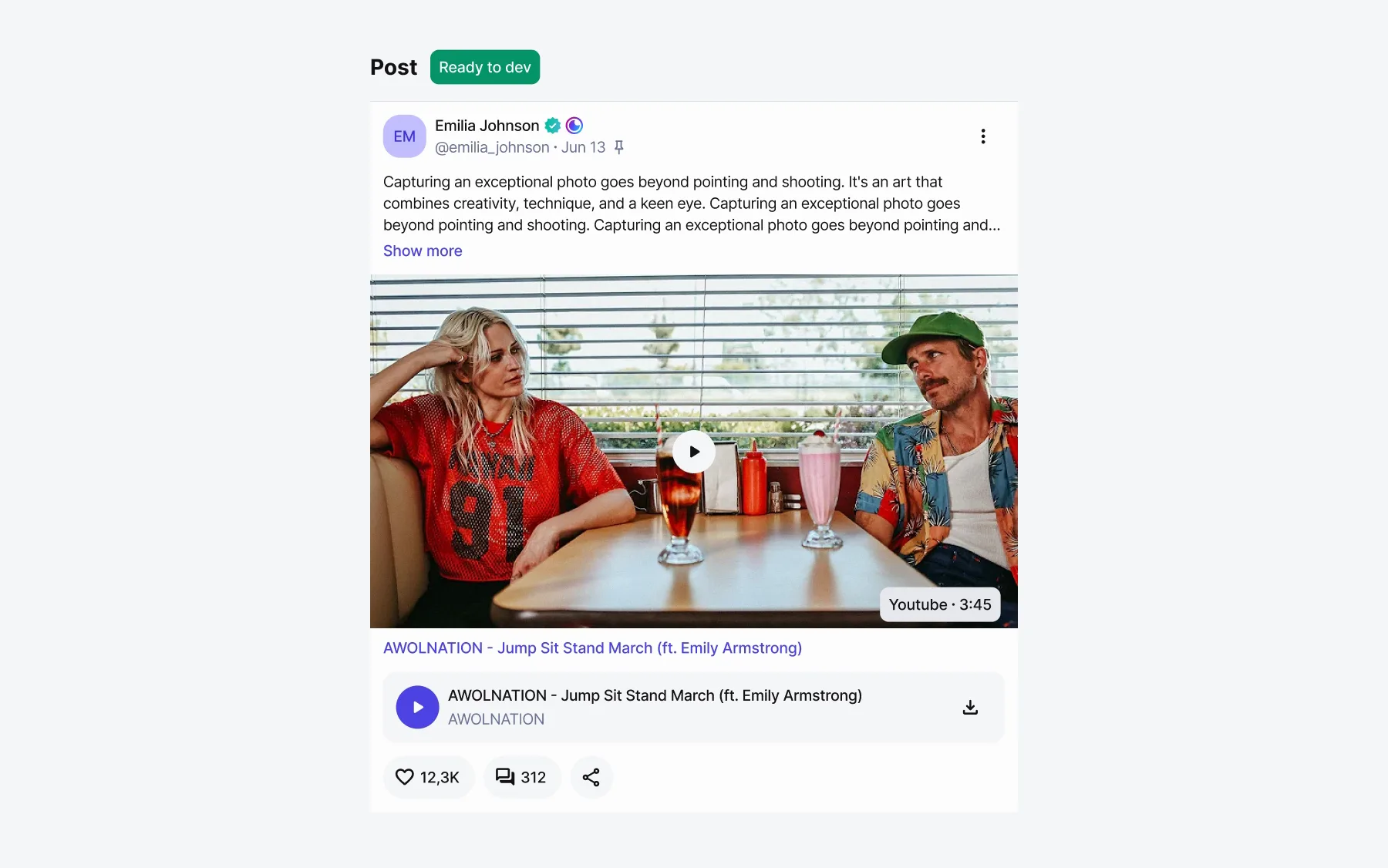
The Post component going through its statuses: a grey skeleton at To design; the header and text filled in at Draft; the video and link at WIP; the whole post with review notes at To review — “3 lines Max. to show Show more button”, the rule for long usernames with a badge, media before links and audio, 600px wide; and clean at Ready to dev.
Press a status to see Post at that step. The notes at To review are the ones on the component page.
The handoff card of a profile section: a green Ready to dev header, the breadcrumb Lyvely App / Actions (My profile), the section name, Useful links and Questions.
The handoff card at the top of a section in the product file.

A week, then two days

Measured by sprints, a new screen went from a week to two days once it was assembled from the system instead of drawn.

Next

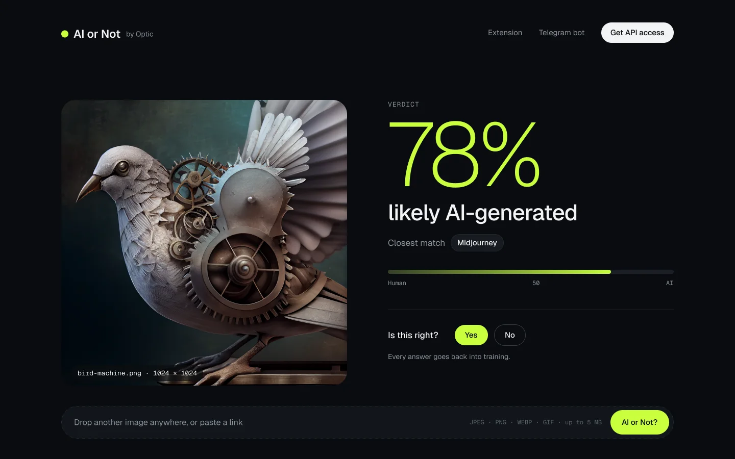
The AI or Not verdict screen: a steampunk bird made of gears beside a huge "78%", "likely AI-generated", closest match Midjourney, a bar from Human to AI, and "Is this right? Yes / No — every answer goes back into training".

OpticHead of Design2023–2024

AI or Not

the AI-image detector Optic launched in 2023. I designed it from the first draft until it became a company of its own.