At OpticProduct Designer2023WebUX review, redesign, brand, pitch deck

Essense

An AI tool that reads thousands of app reviews and tells a product team what to fix first. I was called in for a UX review and stayed for the redesign, the brand and the pitch deck.
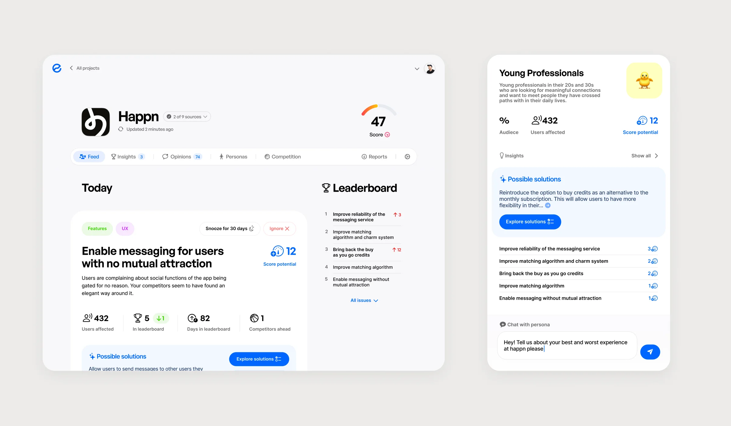
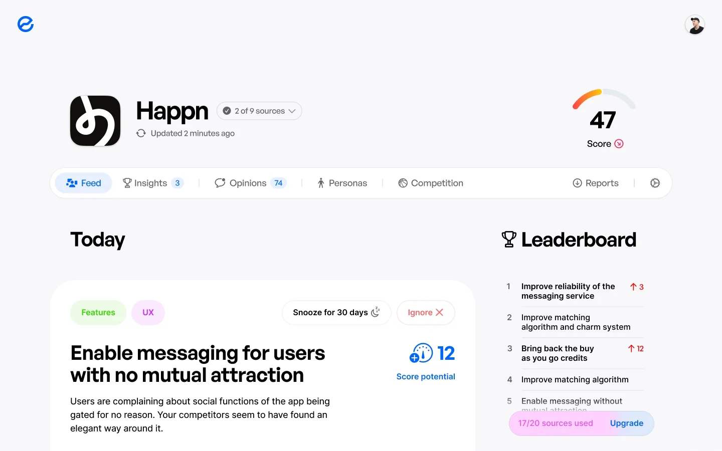
Essense after the redesign: the Happn project with a Score of 47, a feed of issues led by “Enable messaging for users with no mutual attraction”, a leaderboard of issues, and the Young Professionals persona with a chat box.

Where it started

Charts, and no answer

Essense started as a side project inside Optic. It collected reviews from app stores and drew them: a line of positive against negative, a table by week, a chatbot you had to know how to ask.

Nobody could say how to create a project, where to read the analysis, or how to break it down. The data was all there. The conclusions weren’t.
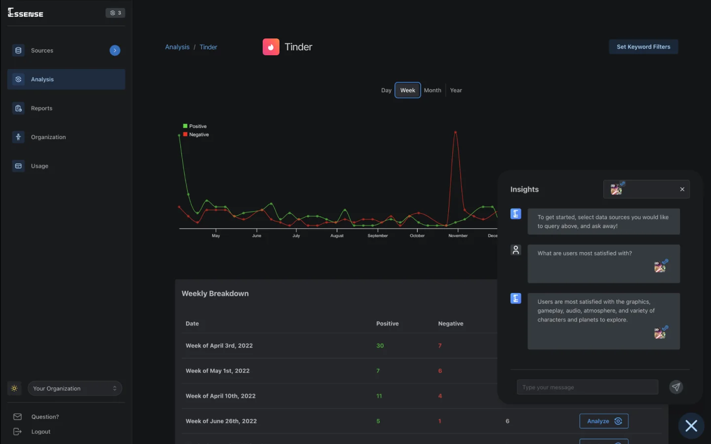
The old project page: a dark admin with a positive and negative line chart for Tinder, a weekly breakdown table, and an Insights chat panel.
Before. The project page: a chart, a table by week, a chatbot.
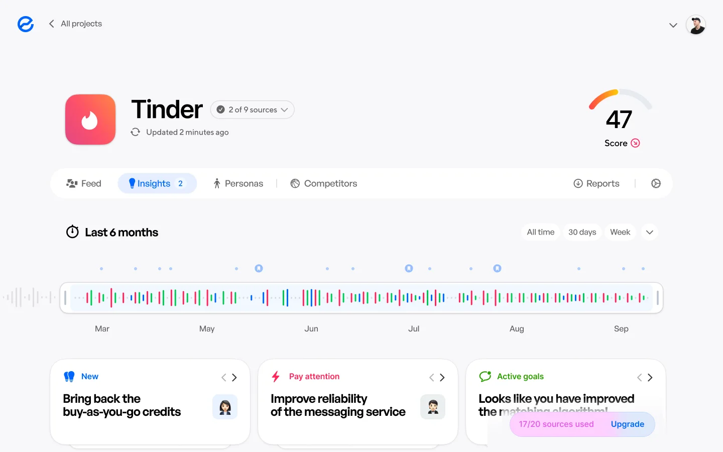
The new project page for Tinder: a Score of 47, tabs for Feed, Insights, Personas and Competitors, a six-month review timeline, and three insight cards.
After. The same page. A Score, a timeline of reviews, and what to do next.

The review

A review that became a redesign

I started inside what existed: fix the worst, keep the rest. Sources moved into the project, so a new project took four screens instead of nine. The projects list lost its search, sorting and filters; it had been built for dozens of projects, and people had one or two.

That fixed getting started. The page you land on still showed data instead of answers, so the review turned into a redesign.
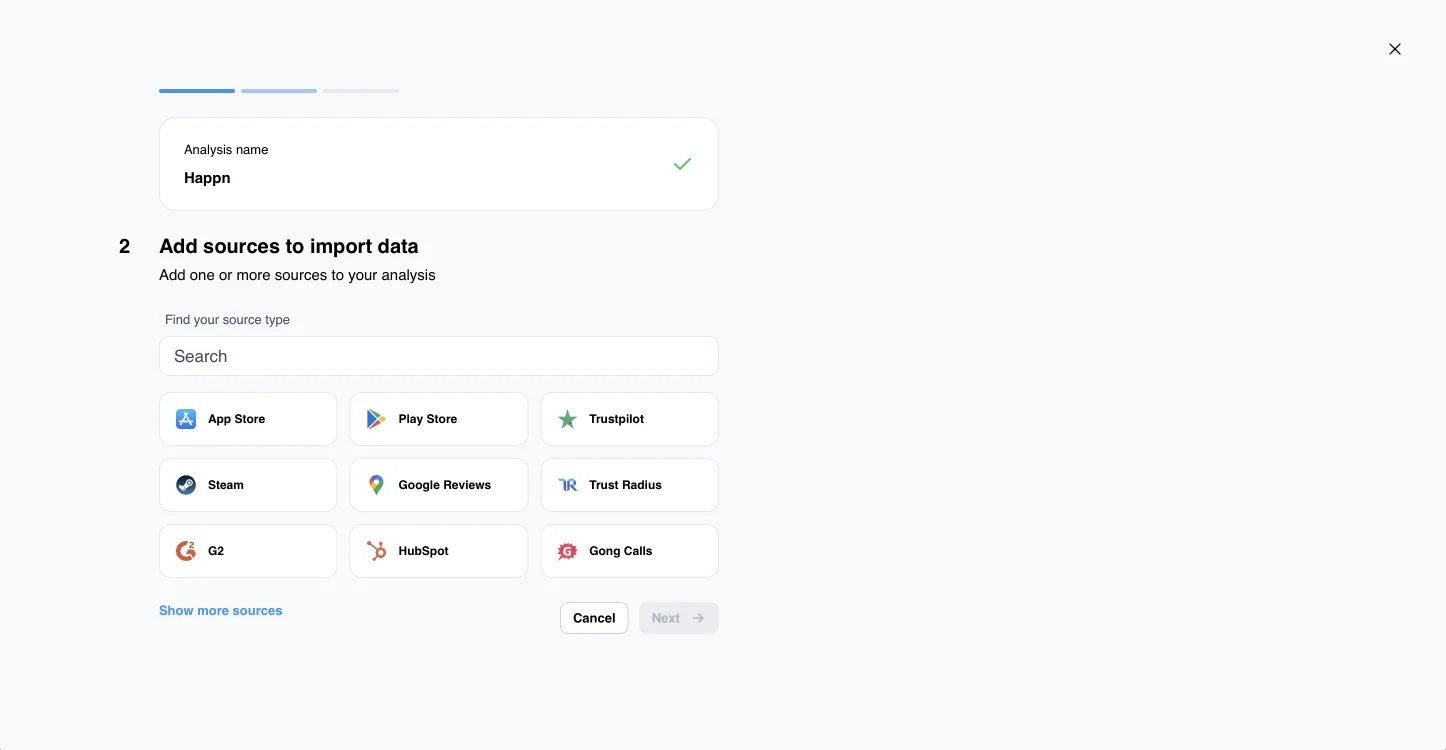
The old new-project flow, step 2 of a separate wizard: Add sources to import data, a search field and nine source types, Cancel and Next.
Before. Sources were a wizard step of their own — one of nine screens.
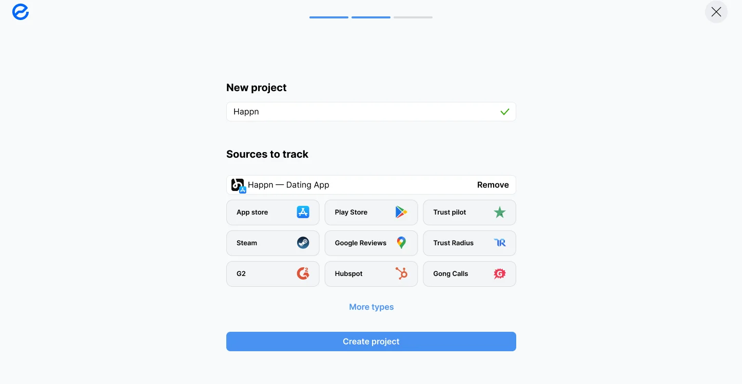
The new New project screen: the name Happn, Happn — Dating App already under Sources to track, nine source types to add, and Create project.
After. Name, sources, create — the last of four. Sources live inside the project and switch on and off there.

Decisions

Analytics became a to-do list

One number

Every project gets a Score, and every issue shows how many points fixing it would win back. What to fix first is on the screen.

Price: one number hides nuance, and the formula behind it has to be one people trust.
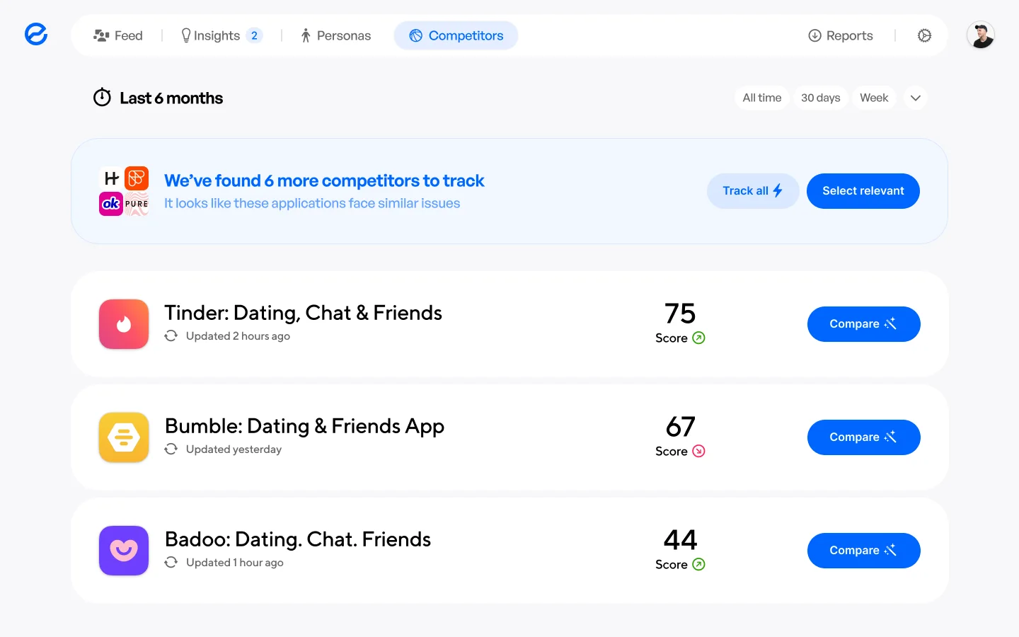
Competitors: six more found to track, and Tinder 75, Bumble 67 and Badoo 44, each with a Compare button.
One scale for everyone. Competitors are found automatically and scored the same way, so 47 means something.
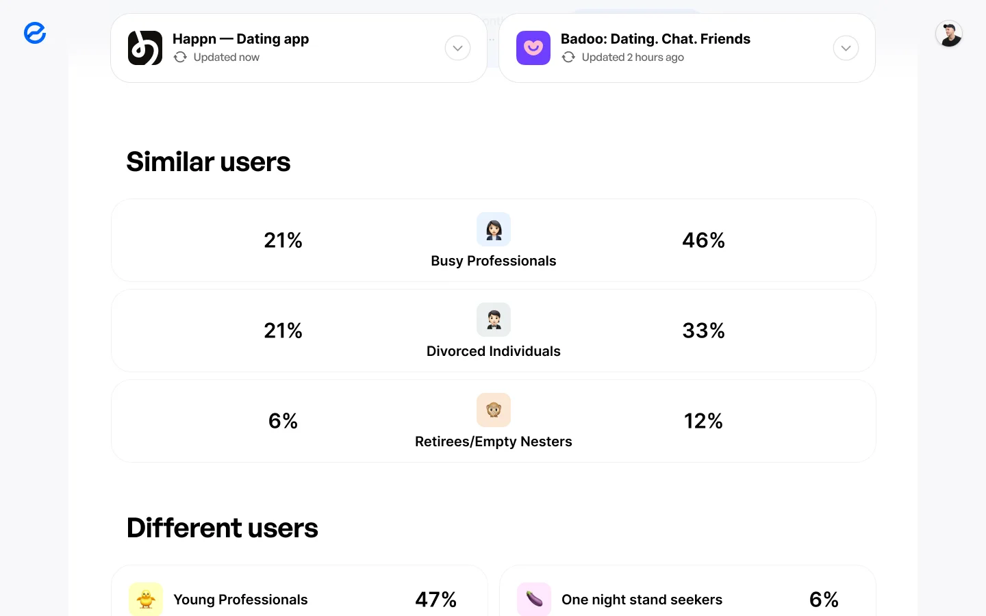
Comparing Happn with Badoo: similar users — Busy Professionals 21 % and 46 %, Divorced Individuals 21 % and 33 %, Retirees 6 % and 12 % — and different users, Young Professionals 47 % against One night stand seekers 6 %.
Compare puts two apps side by side: which audiences they share, and which only one of them has.

A feed, not charts

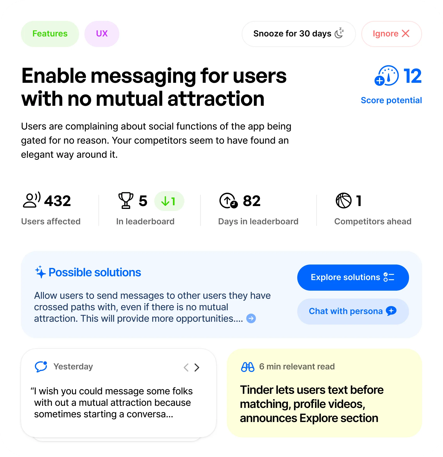
Each issue is a card: users affected, place in the leaderboard, competitors ahead, a real quote, possible solutions. You open the product and see what to do.

Price: the raw data and the weekly table moved a level deeper.
The Happn feed scrolling: today’s issues one after another — enabling messaging, bringing back buy-as-you-go credits, an improved matching algorithm, app crashes on the rise — with events between them.
The feed, scrolled. Issues ranked by what they cost, and between them what changed: a competitor catching up, new rivals found, new sources added.
An issue card: Enable messaging for users with no mutual attraction. Score potential 12, 432 users affected, fifth in the leaderboard, 82 days there, one competitor ahead, possible solutions, a user quote and a six-minute relevant read.
One issue, up close. How many people it hurts, how long it has been there, and 12 points of Score to win back.

Personas you can ask

Similar reviews cluster into a persona — Young Professionals, Busy Professionals — and you ask that group, not an empty chat box.

Price: the answers have to stay grounded in the reviews, or the persona starts making things up.
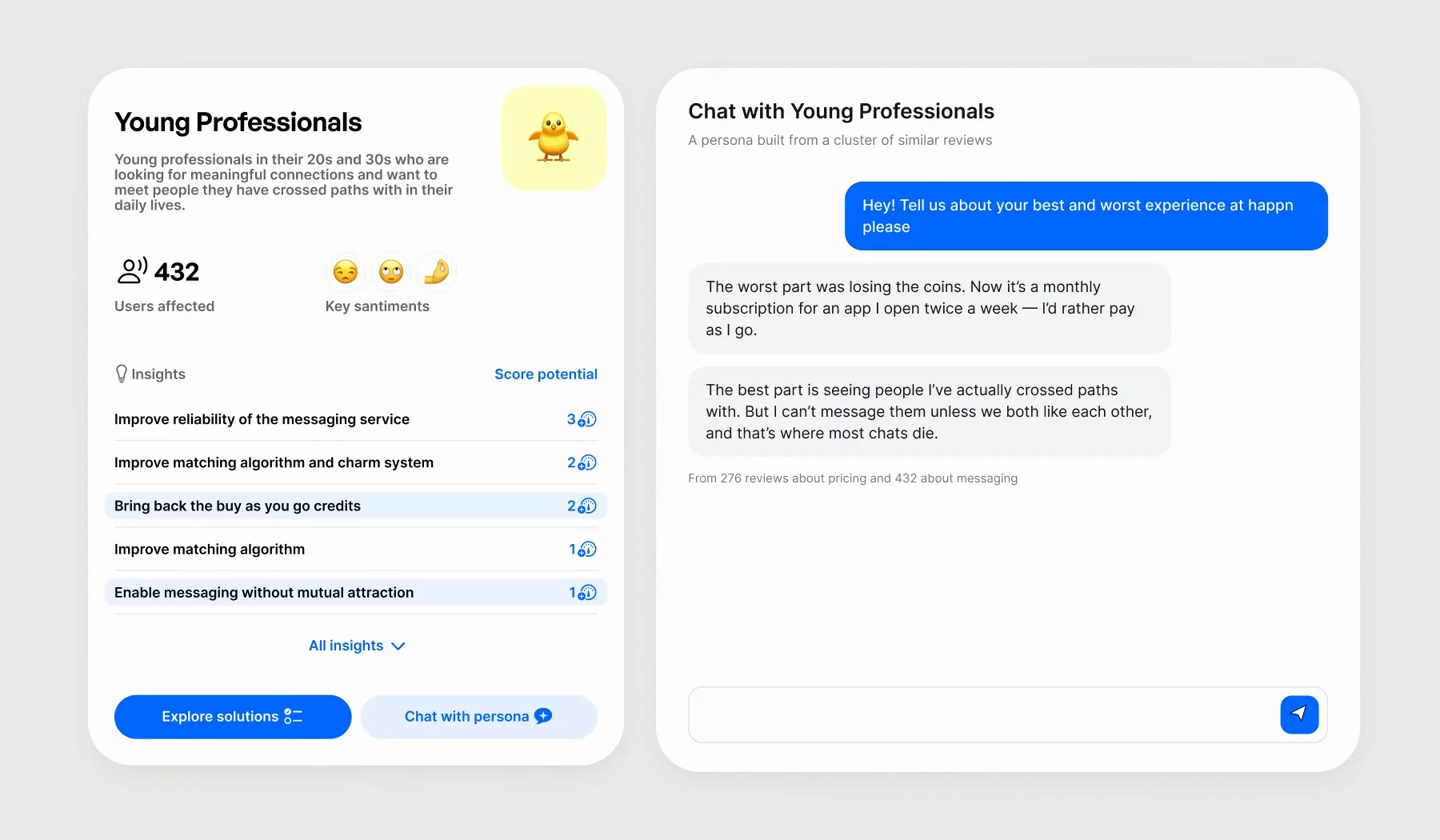
The Young Professionals persona beside a chat with it: the question “Tell us about your best and worst experience at happn”, a typing indicator, and two answers — about losing pay-as-you-go coins and about not being able to message people without a mutual like — while the matching issues light up in the persona’s list.
Ask, and the issue lights up. Each answer points back to the problem it comes from, and to how many reviews stand behind it.

Brand

The brand came first

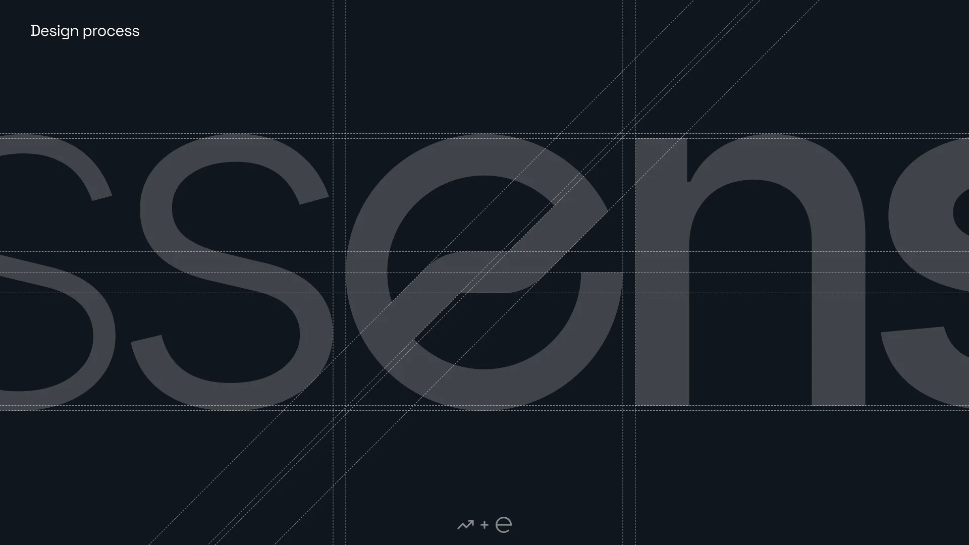
The old wordmark was stencil capitals on a dark admin. The new one is lowercase, and the “e” carries a line chart: the product pulls a signal out of noise, and the mark says so. The weight grows across the word, 100 to 700 — the essence surfacing from thin noise.

It’s built on Inter, so the brand and the interface share one typeface. The interface was drawn after, in the brand’s blue.

The price: the chart doesn’t read at icon size, so the icon uses the “e” alone. The lettering is drawn by hand and can’t be typed.
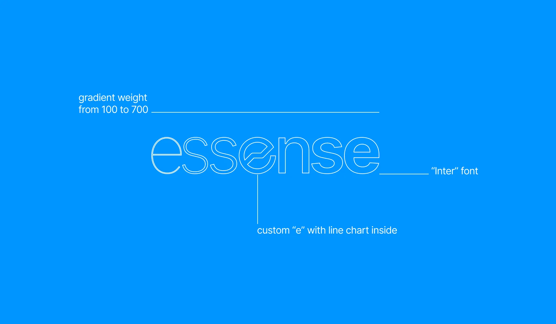
The essense wordmark in outline on blue, annotated: gradient weight from 100 to 700, a custom “e” with a line chart inside, Inter.
Design process: the letters s, s, e, n, s at large size on a construction grid, the “e” cut by a diagonal chart line.
The “e” on its grid.
The app icon: a white “e” on blue with a faint wave pattern.
The icon keeps the “e” alone.
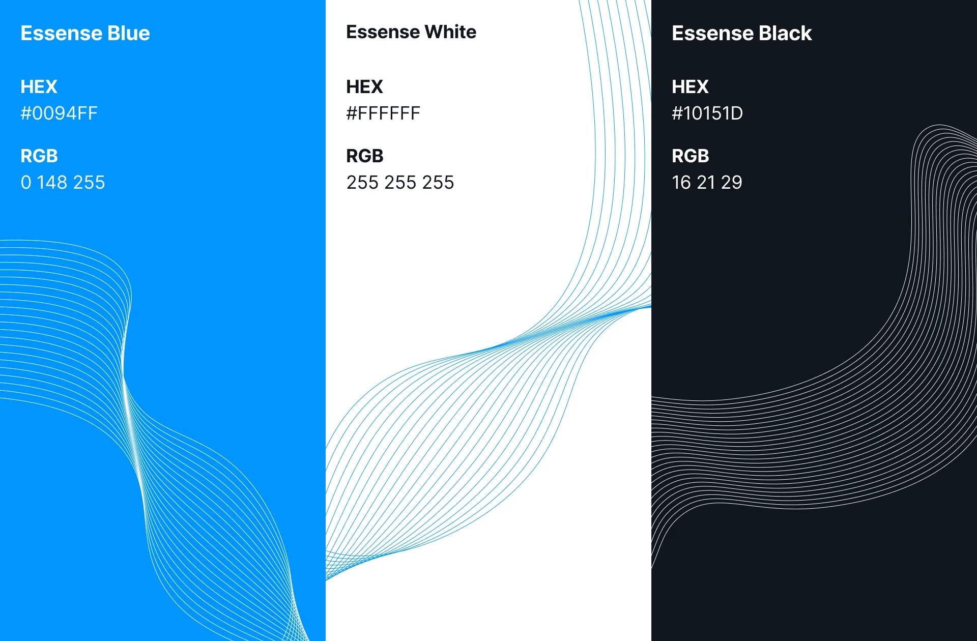
Essense Blue #0094FF, Essense White #FFFFFF and Essense Black #10151D, each with a wave-line pattern.
Blue, white, black, and the wave.
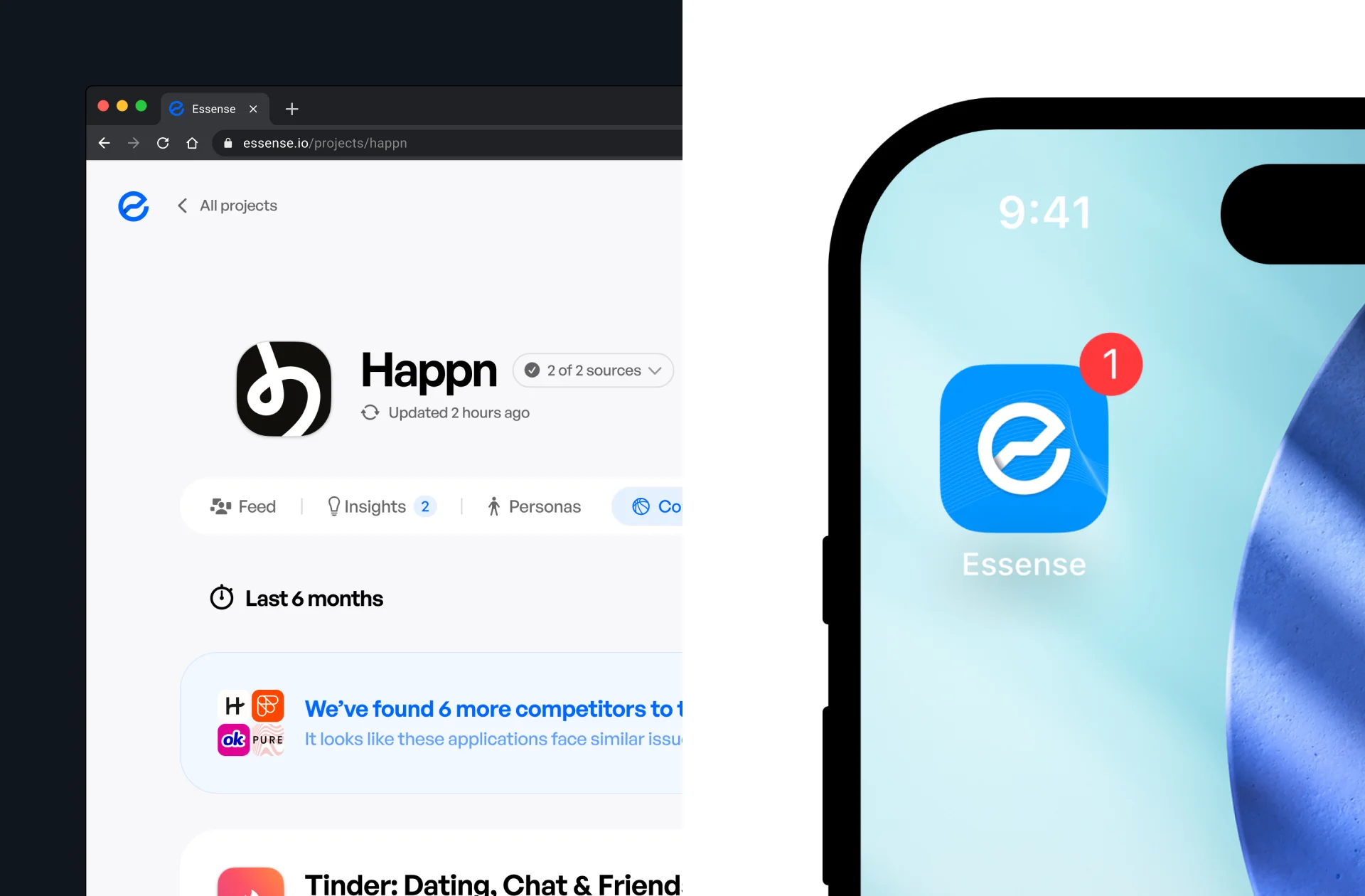
The product at essense.io in a browser, and the Essense icon on a phone home screen with a notification badge.
The brand in the browser and on the phone.

Pitch

Then the deck

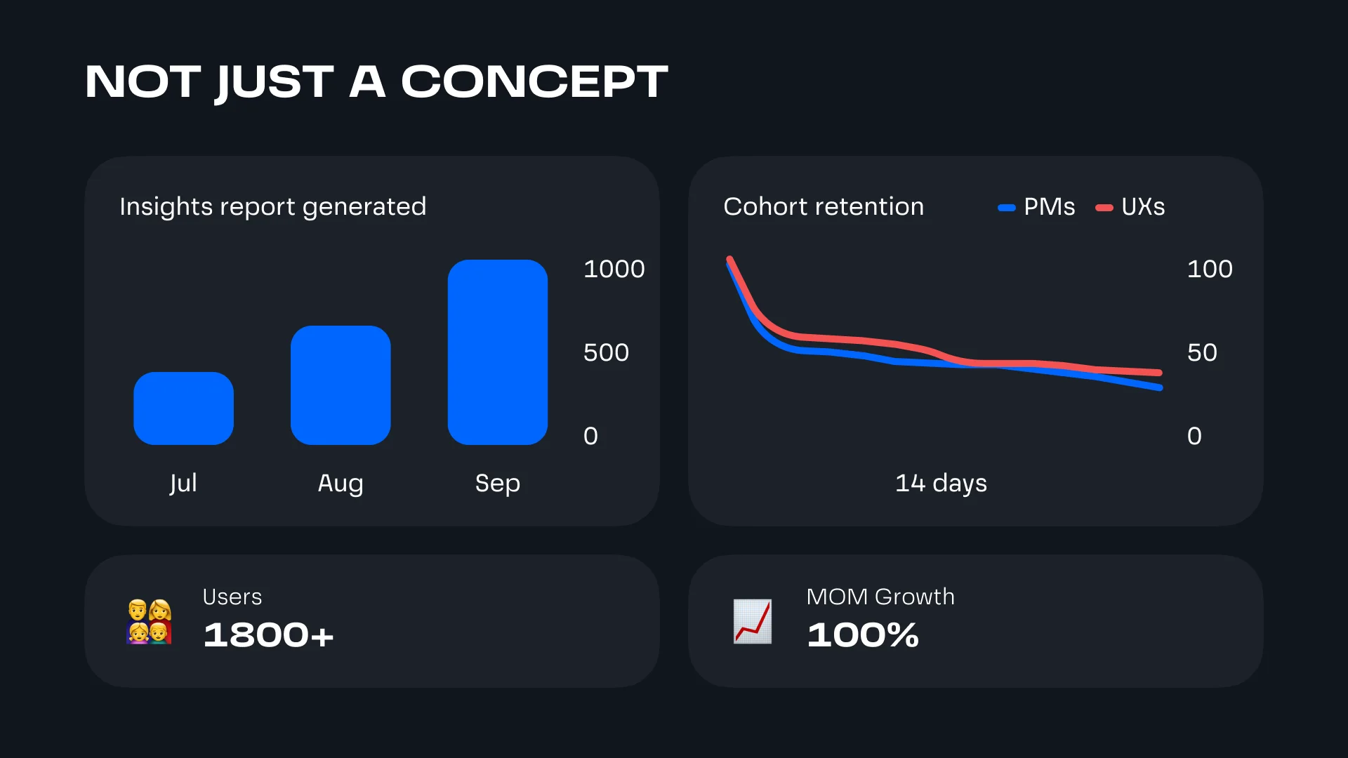
The same brand and screens went into the pitch deck. By then Essense had 1,800+ users, and from July to September 2023 it grew 100 % a month.
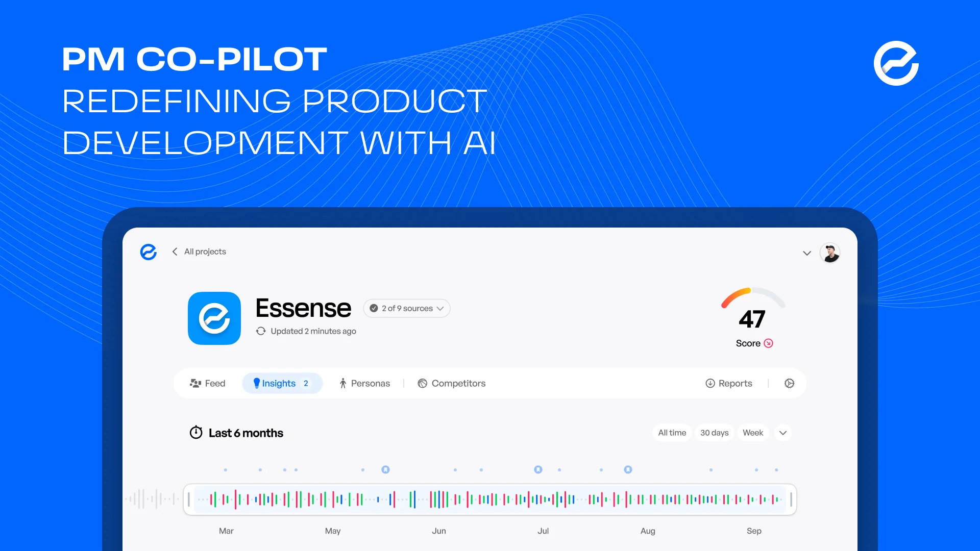
Deck cover: PM Co-Pilot, redefining product development with AI, over the Essense product page on a laptop.
Not just a concept: insights reports generated rising from July to September, cohort retention for PMs and UX designers, 1,800+ users, 100 % month-over-month growth.

My part

One designer, from review to deck

I was the only designer, working with the founders and Optic’s engineering team. After the redesign the product went its own way and carried on without me.

Next

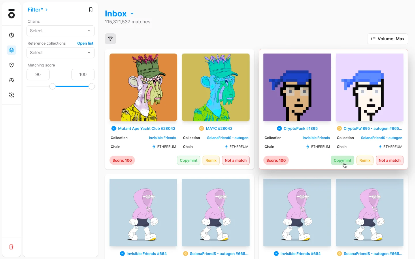
The Optic moderation tool: an inbox of 115,321,537 matches, each a pair of NFTs side by side with its collection, chain and a match score, and three verdicts — copymint, remix, not a match.

Head of Design2022–2025

Optic

the NFT moderation tool OpenSea's own moderators used, and OpenSea then acquired.