Context
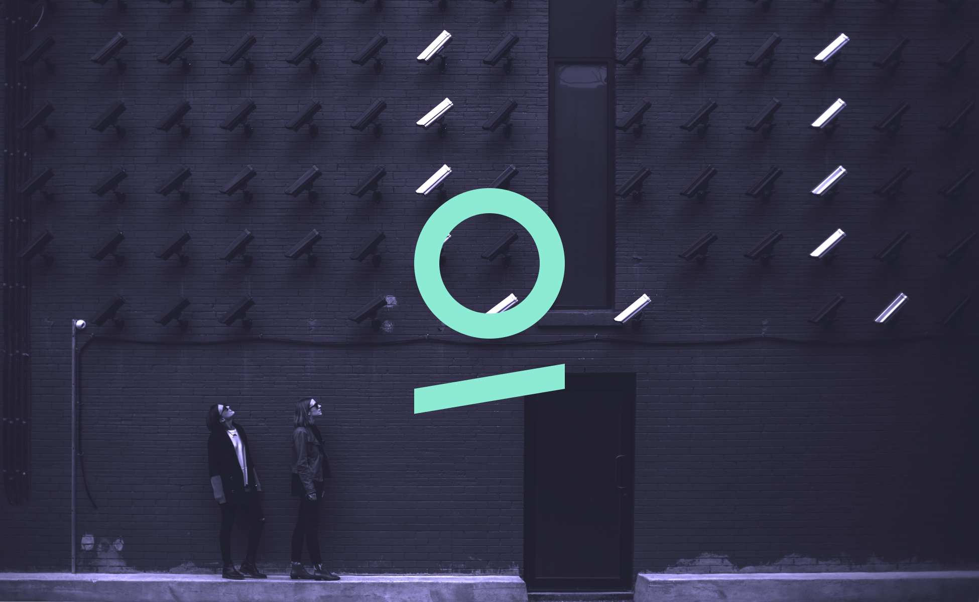
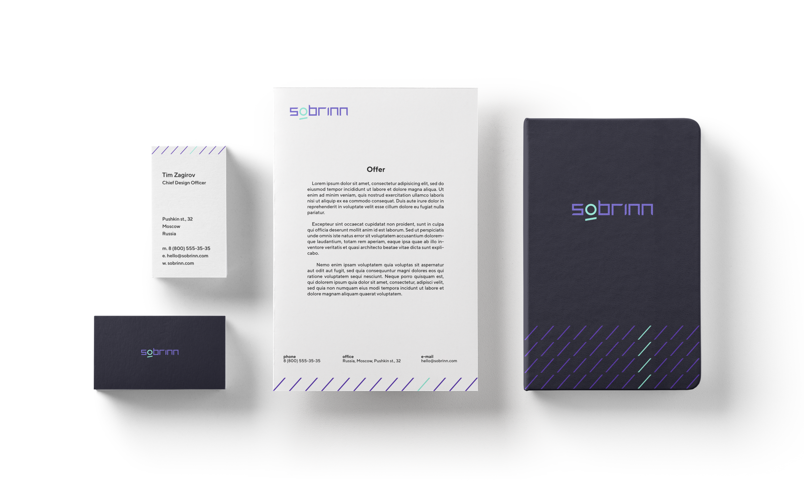
When I joined, Sobrin existed only as a name and a product. My role was to translate a purely technical product into a visual identity that feels reliable, sharp, and modern. The result is a timeless brand system that communicates focus, precision, and trust — key qualities of a company working in visual intelligence and surveillance software.
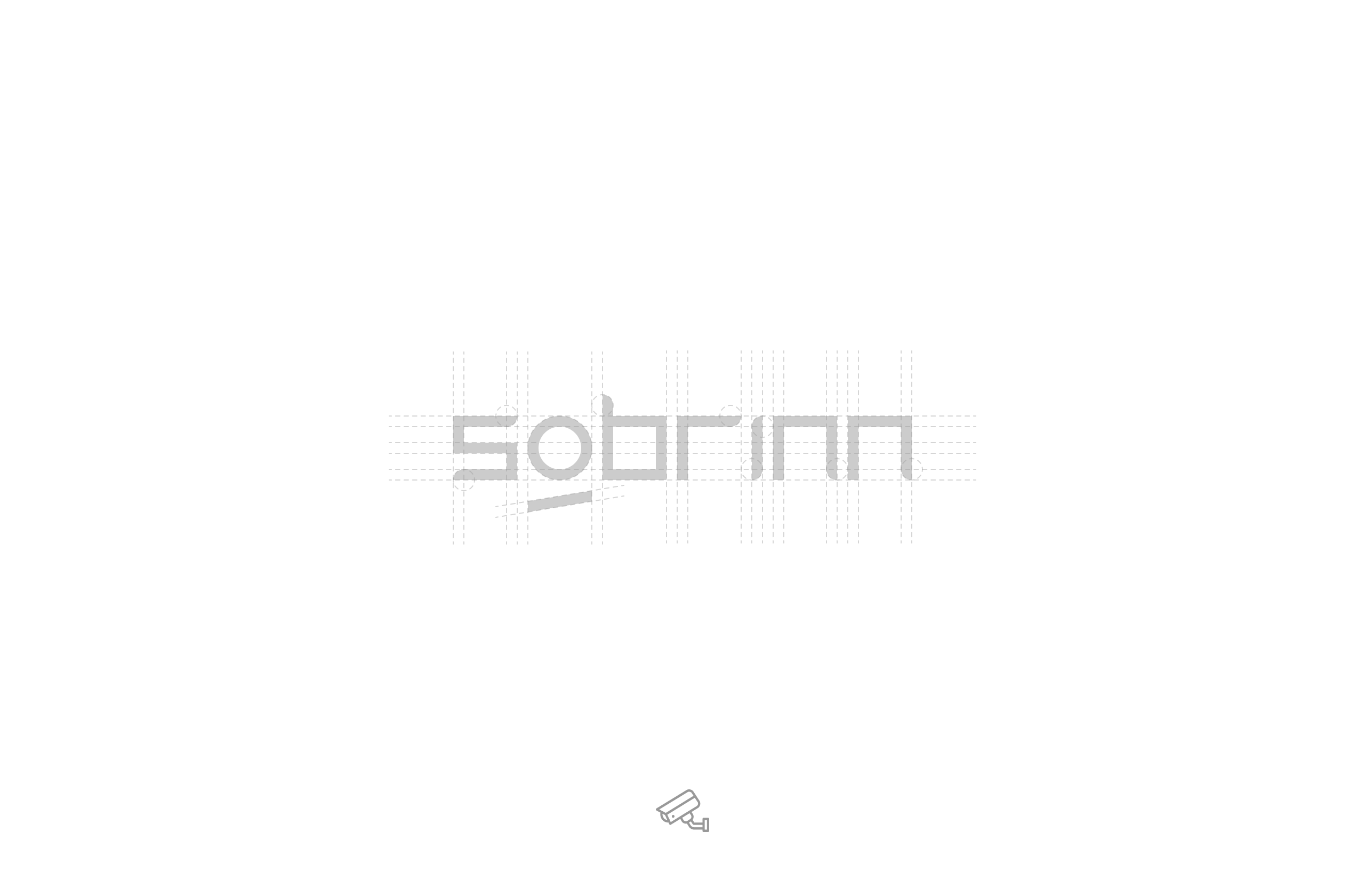
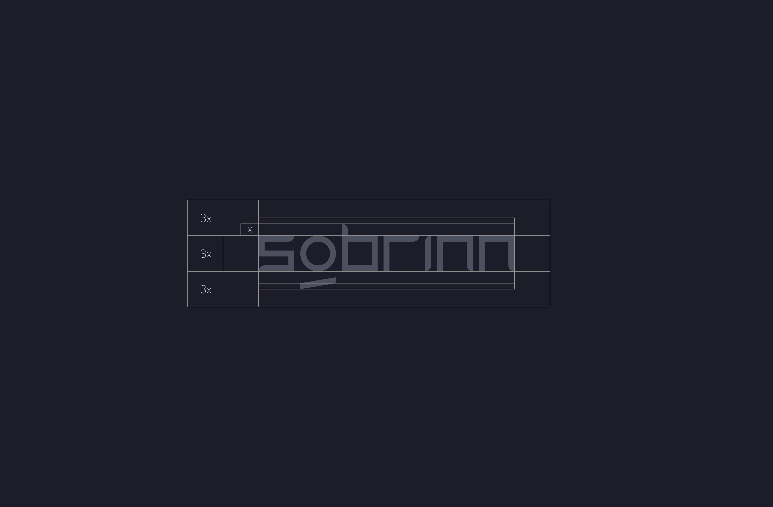
I led the branding and art direction for Sobrin — a software company developing intelligent video surveillance solutions. The team had no existing visual identity, so I built the brand entirely from scratch: from concept and logo to visual system and motion direction.
Goal
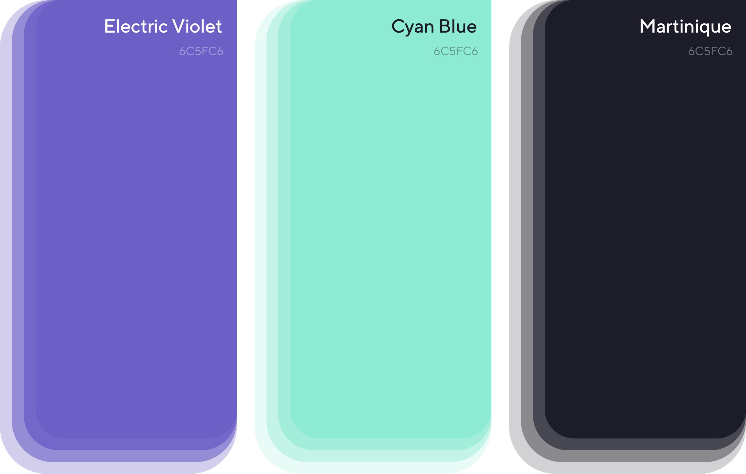
The goal was to establish a strong and confident visual foundation for a tech brand operating in the security and analytics domain. I developed a minimal and geometric logo system, symbolizing precision and control — key attributes of video monitoring solutions. The color palette, typography, and motion direction were designed to convey trust, intelligence, and sharpness, while keeping the brand accessible and future-ready.
Deliverables included:
- Logo and symbol design
- Brand color system
- Typography and grid guidelines
- Iconography and motion direction
- Presentation and usage rules